Showing posts with label urban design. Show all posts

Tuesday, 23 July 2013

Explaining Sydney's unique apartments

Many parts of the world, and more particularly many cities, can be recognized by their urban forms that are the result of historic periods of dense apartment developments at a grand scale.  Think Paris under the scalpel of Baron Haussman and the likes of the Pereire brothers, bankers and land developers.

Not only did these cities change as 'public living rooms', but the forces of culture and the speculative market also created characteristic apartments.  It isn't hard to describe from memory the 18th century apartments of Budapest, with their four meter ceilings and rambling en-filade rooms, nor to see the pervading influence of their type through the 19th century booms and even in post-WW2 modernist housing in that city.

The influence of ahistoricist  modern architecture, and the social project that so emphatically informed its earliest proponents, broke most of these traditions.  What replaced them is arguably something of an almost homogeneous trend in European apartment design.  That is not to say that modern European apartments are actually all the same, but there is a pervasive and recognizable emphasis on the formal solution of the apartment block, and the generally highly disciplined, spatially efficient, repetitive apartments those blocks embrace in their singular forms.

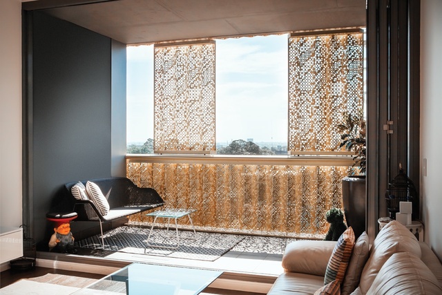
Sydney, in far-off Australia, stepped out of line with this trend at the beginning of its latest housing construction boom, impelled to produce a special body of apartment buildings under the influence of a unique regulatory instrument.  Of course, it is possible that it only seems like that to those of us parochially on the inside, but in my experience, it is remarked on by many architects who visit Sydney from the outside.  I am forever tempted to attempt an explanatory book, redolent with the sort of sun and surf images that would also make it a coffee table success.  But I rarely get around to more than a pamphlet, concentrating on my own special work as a consultant for solar access and natural ventilation analysis.
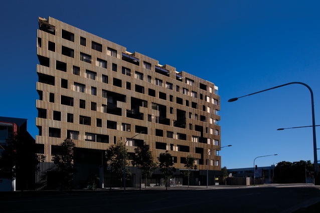
So it is doubly welcome to read a local building review, which escapes the usual cliched boundaries into a succinct explanation of the evolution of this local building type.  Doubly welcome, because it addresses itself to the emerging limitations, and subtly hints at an imminent convergence with contemporary European modernist influences.

The article is on ARCHITECTUREAU, which often doesn't tell you up front who is the author. As I was reading, I became progressively more curious just who it might be, and was not surprised that the piece is by my long-time colleague Tone Wheeler.  Tone can explain almost anything architectural by some well turned aphorisms, and almost anything he writes is well worth reading.

To read Tone Wheeler on 17 Gadigal Avenue, click here.

As usual, feedback would be welcome.   

Monday, 20 May 2013

Junk Architecture

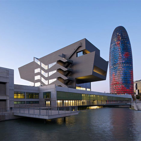
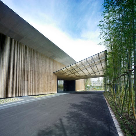
Sometimes the juxtaposition of two images, introducing articles on two different buildings is just so striking that it prompts you to commit to an opinion which you might otherwise hesitate to put out in public.  I had just such an irresistible urge, when once again viewing Dezeen, and seeing first an article on the new Design Museum in Barcelona by local studio MBM Arquitectes, followed closely by one on the Garden Terrace Hotel in Miyazaki by Japanese architect Kengo Kuma.

It might be a little unfair to compare such two dramatically different building types, but not if the main frame of reference is the way in which they represent different attitudes to urban design.

I find it fascinating that the headline image of the Japanese building is in fact its unadorned blacktop driveway, and the way that such a humble utilitarian fragment can speak volumes about the entire narrative of cities as a series of gradients from the public to the private, played out fractally at different scales.

In contrast, the Spanish museum looks for all the world like one of those metal toolboxes, serving  as some ill-conceived metaphor for its exhibitions, while its urban gestures of water, overlooking lawn and long, glazed events space are portrayed as clumsy and forlorn.

The supporting images of each project serve only to reinforce the contrast.  The delicate refuge of the Japanese, a jewel in natural materials and greenery, subtly manipulating spatial sequence, and making the most of its introverted courtyard; the Spanish museum in comparison like dumped aluminium junk.

Mind you, I am conscious that even a casual study of the plans included in the article on the Design Museum reveals that on the urban design front, the photographer has done no justice to the concept. His frame appears drawn irresistibly to the architecture as sculpture, or possibly to Jean Nouvel's phallic Torre Agbar office tower behind it.  Ironic that the photographer should be taking the images from the other side of the new 'lake', a more crafted bank with steps down to the water, affording choices of summer shade, if not complimentary sunny winter prospect.  The new Design Museum may not be junk architecture, but even after allowing for the photographer's poor choice of images, it still looks like it.

Read the articles at:
http://www.dezeen.com/2013/05/18/dhub-museu-del-disseny-de-barcelona-by-mbm-arquitectes/
http://www.dezeen.com/2013/05/18/garden-terrace-miyazaki-by-kengo-kuma-and-associates/

Wednesday, 6 March 2013

Winners for Green Square Library competition

The international competition, for a community library and public space in one of Sydneys most important regeneration areas, has thrown up a clear winner.  Young local architects Stewart Hollenstein, in association with Colin Stewart Architects offered a scheme recognizably different in ideology and architectural approach, and have been deservedly rewarded for it.  The winning design incorporates an outdoor plaza to create multiple sites for play, work and rest. Some of the buildings are below ground while bookshelves sit outdoors in the plaza. The design includes an amphitheater, a storytelling garden, water play zone and wide open spaces for festivals.

The overwhelming majority of the more than 140 other entries were desperately looking for some reason behind buildings as objects, with some of the narratives highlighting the arbitrary search for novel forms that characterizes contemporary architecture.  In contrast, the Stewart Hollenstein and Colin Stewart entry stood out even in the short listed schemes, for having a true appreciation of urban design as an emergent phenomenon.


During the second stage design development, when the identities of the short listed entrants were already known, the presence in the collaboration of the hugely experienced Colin Stewart must have given the jury comfort.  Colin started his urban design career as a student by being a runner up in the Pompidou Centre Competition over forty years ago, and was in the right place at the right time to grasp some unique opportunities for creating town centres during the development of contemporary Canberra.  But to put too much weight on that would be doing no justice to the other members of the team, whose progress through the Architecture program at the University of New South Wales always suggested they would be stars to watch.  The jury's citation says it all: 

"By far the most interesting and stimulating Stage 1 design and was unanimously agreed that it was simply the most appropriate proposal for this site."
For the jury's comments, and downloadable PDF files of the winning entry, go to the site of the City of Sydney here.

If you are enthusiastic enough, you can review all of the entries by downloading the whole collection at: