Sunday, 22 September 2013

Tastefully green

By now my readers would be used to my predilection for puns.  Admittedly, this post title is worse than usual, as I refer to the continuing efforts to introduce into the densest urban fabric of our cities some meaningful local food production.  The issue was brought to mind by a tasteful photo spread in Inhabitat, headlined Shanghai Shopping Mall Sprouts a Flourishing Urban Farm!

The K11 mall is spruiked as an ‘Art Mall’, and as Inhabitat explains, seeks to break the mold of the average consumer shopping experience in China.  Its urban farm is one of its most unusual and inviting aspects.
Located in the middle of the mall, the farm uses soil-free cultivation methods and it provides a bit of green respite for urban visitors.  The mini-farm is currently producing tomatoes, eggplants and hot peppers, but with autumn on the way they will soon be switching to different seasonal produce. The vegetables are grown using automatic irrigation systems, and LED lighting supplements the daylight that floods in through the mall’s windows.
Indeed, the farm is tastefully displayed, much of it behind glass and branded like much else in China was the potent combination of high-end information technology references in English.  I sound like I'm cynical, but I am trying not to be.  It is actually hard to give credit where it is due, for an effort which is about raising consciousness of the possibility of urban food production, while questioning whether it distracts from the realities of how that might be brought about.
There are many attempts at quantitative treatment of the true proportion of our total resource expenditure that is conventionally dedicated to feeding the city.  But for some reason, it is very rarely highlighted.  For popular consumption, the outcomes of such analysis are usually buried in the metaphor of the 'ecological footprint'.  While useful as a scary headline, that tends to mask the sobering detail.
To see, for instance, a simple graph of the embodied energy of feeding ourselves, as a proportion of recurring energy consumption by a typical, developed world household, conveys a subtly different message.  Who would like to confront the suggestion that we might be using five times as much energy for our food to get to our door, as for otherwise running the dwelling?
Exactly how the fabric of the city might be modified to achieve a meaningful impact on the status quo, has also been the topic of thought and experiment.  But it would be fair to say that most often when food is introduced into discussions of urban sustainability, the conversation relies heavily on the romance of residents growing nominal amounts, either individually or as communal activity.  It kind of sneaks in under the social banner of a triple bottom line framework.

Meanwhile, rare is the city in the world that is not gobbling up its surrounding agricultural land, pushing out even the market gardens that traditionally were able tuck themselves into pockets of flood prone land between suburbs.  It will be interesting to see what intimations of catastrophe eventually force us to confront this issue. What I would like to see are the prototypes of urban agriculture that are actually capable of producing commercial quantities; the diversity and complexity of ecosystems that supply a greater proportion of our needs. Urban forestry, vertical fields, professional farmers able to make a living, rather than mere cute spectacle. 

Houdini Tower

Don't know how I missed this. Oh, that leads to a lot of lame jokes.

Korea Will Soon Be Home To The World's First 'Invisible' Skyscraper reads the headline in Business Insider Australia, a site that doesn't seem to have all that much with business.  The article goes on to describe a proposal from GDS Architects, for a very tall tower clad with an LED facade system with optical cameras to display what’s directly behind the building. When turned on, the “reflective skin” of the building will give the illusion that Tower Infinity is blending in with the skyline.

Better to read the original article, replete with illustrations. It's amazing how easy it is to whip up alternative realities these days in Photoshop, describe them with verbs that blur the distinction between the imagined rhetoric and the built outcome. No point my summarizing the breathless claims here.

Why the reference to the great escapologist in the headline of this post?  Harry Houdini famously claimed that he could make an elephant disappear in a crowded room.  While the simile is attractive, the metaphor is compelling.  It was Houdini's explanation of the trick that is the most relevant: that he would do it by distracting us.

BMW had a go at this idea, and executed it in the flesh, for a promotion,  As a car advertisement, it was amusing, and the question could be safely asked: Who in their right minds would actually do this for real?  Ad campaign over, the car could be safely relegated to the BMW museum, or wherever they retire such engaging toys.  But a building?
So, why exactly would you want to make a very tall tower very near Seoul's international airport invisible?  I guess you really wouldn't.  It's just an excuse to propose a giant billboard.  After all, "the building’s projections may also be used for broadcasting special events, or for advertising purposes, according to GDS Architects".  But that isn't the real distraction.

For the price of a couple of undergraduate renderings and a well placed media release, GDS Architects have as much promotional exposure as if they had actually built a worthwhile building.  Magic, isn't it?

Read the rest of the article here.

Sunday, 15 September 2013

The little house that could


Australian Fibro House Wins 2013 Solar Decathlon China  

In one of the least heralded pieces of news, I find my faith in architecture almost restored.  Mercedes Martty, writing in Sourceable, reports that the Illawarra Flame 'fibro' house was the only entry in the prestigious competition (held for the first time outside the US or Europe), to take an existing home, and convert it into an energy efficient one.  But that did not stop the building producing more energy than it uses, by combining PV solar panels on its roof, employing a combined solar panel and air heating system, and providing for greywater recycling that uses an artificial wetland integrated into the garden, to filter the water.

Refreshingly, the project scored 957.6 of a possible 1000 points in the competition, and beat out an international field of notably more bespoke designs.  Perhaps it isn't quite as glamorously edgy as some previous winners of the original Solar Decathlon competition sponsored by the US Department of Energy. But the approach adopted by the consortium of University of Woolongong students and local trade apprentices from TAFE Illawarra, is of tremendous significance in influencing the general public.

As reported by Architectural Record magazine, the home-spun vernacular of the winning entry is anything but unsophisticated:
Aided by complex computer modeling, the Australian team pioneered the use of second-generation, poly-crystalline photovoltaic panels, compliments of their sponsor BlueScope Steel, to fashion a dual system that maximizes solar power generation efficiency. The house is not only a retrofit of an existing structure (a first in the solar decathlon), but also a dramatic turnaround for an energy-guzzling housing type prevalent in Australia that uses fiber cement sheets for construction. The team incorporated off-the-shelf systems and indigenous solutions and the result was what the architecture jurors called “modest and humble, yet innovative.”
For those unfamiliar with Australian vernacular, 'fibro' is the local endearment for a thin fibre reinforced cement sheet, with which post-WW2 austerity housing was clad.  These houses are still to be found in the outer suburbs of Australian cities, though like Levittown near NY (the famous estate of 'little boxes on a hilltop'), many have been extensively renovated and reclad.  Arguably, many contemporary MacMansions are also effectively elaborations in composite construction of these earlier prototypes.

Be that as it may, the win reinforces the importance of paying attention to our existing building stock, which vastly outnumbers the potential new build of the immediate future.  It demonstrates that even poorly performing buildings of the post-WW2 perieod are suitable for effective retrofit, and that such improvements can lead to building performance that may outperform equivalent new build.

Congratulations to the people whose dedication made it happen.
See more at: http://sourceable.net/australian-fibro-house-wins-2013-solar-decathlon-china/#sthash.amkpiznQ.dpuf

The next Solar Decathlon is scheduled for October 3-13, 2013, in Irvine, California.
Mercedes Martty
An Australian suburban fibro home transformed to achieve net-zero energy consumption has won the 2013 Solar Decathlon China, one of the most important energy competitions in the world. - See more at: http://sourceable.net/australian-fibro-house-wins-2013-solar-decathlon-china/#sthash.38k0toPZ.dpuf
Australian Fibro House Wins 2013 Solar Decathlon China - See more at: http://sourceable.net/australian-fibro-house-wins-2013-solar-decathlon-china/#sthash.38k0toPZ.dpuf

Occam's Razor cuts to the bleeding obvious

Occasionally (excuse the pun) you see a statement about a piece of architecture, that could be an elegant principle, worthy of repeating.  Sort of like conforming with Occam's Razor that the simplest theory that explains everything is the best theory.  Or Einstein's famous dictum, that all explanations should be reduced to their simplest, but no more.

It was in that spirit that I opened the post on DETAIL das architecture portal headed Four Different Façades – Sports Centre, expecting to see a building with an elegantly inflected marriage of responses to distinct functions, compelling in their 'just rightness'.

Well, the 'work' done by the facades takes the logic of this building a certain distance.  The south-east oriented façade of the swimming pool uses polycarbonate panels as air collectors to generate heat for the building.  And it makes perfect sense that it should be this same facade that has a large operable 'gate', so that the indoor pool can be opened up to the outside in summer. Unfortunately, the other three 'vertical' facades look either arbitrary or simplistic, and frankly don't have any compelling urban or other conditions with which to engage in any emphatic way.  How disappointing.


But also a reality check.  Let's face it, this particular 'principle' has always been used by most buildings, anyway.  You actually have to go pretty far out of your way to produce ruthless 'four part similarity' as in say Palladio's Villa Rotonda.  A good building doesn't actually have to make a virtue of its accommodating the influences of the site, and is likely to be modulated in three dimensions in a manner more complex than simplistically in the planes of four facades.

Perhaps my favourite personal example of this other fearsomely direct approach suggested by the DETAIL blog post, is Nouvel's Musée du quai Branly. But that building is infinitely more subtle. Think about it: the glass veil completing the Parisian street while creating the garden within a site.  The necessary reinforcement of the street corner with the right scale of solid building (I get upset that the iconic green wall distracts from the elementally potent urban design gesture).  The freedom to produce gleefully complicated 'backs' of the bounding buildings for use as studios for artists in residence, the porosity of the 'back' of the garden where it adjoins a residential community away from the boulevards......and so on.

Comparing the Nouvel's building and the "Inselparkhalle" in Hamburg reminds me of the confrontation in a NY street between Crocodile Dundee and the hopeful little thug with the thin little knife.  Like Dundee, Nouvel, might say as he points to the Branly: "That's a building with different facades!"

Sunday, 8 September 2013

It wasn't me! Be famous, fry people. Ho, ho, ho.

Bart Simpson became a fictional comedy sensation for a while with his trademark, disingenuously plaintive denial of responsibility.  But it isn't cute, and certainly isn't funny when something similar is pitched by the architect of a multi-million dollar building wreaking havoc with its surroundings.

I thought at first it might be the beginnings of an urban myth, when the news hit a few days ago, that the so-called Walkie Talkie skyscraper in London was frying cars and making people on the street extremely uncomfortable.  Now we read that it's true.  But even more bizarre is the attitude of the architect.  I may as well quote Dezeen in full:
"....architect Rafael Viñoly has admitted he knew the facade of his curvy Walkie Talkie skyscraper in London would focus an intense beam of sunlight onto a neighbouring street, but says that he "didn't realise it was going to be so hot". 
Speaking to Guardian architecture critic Oliver Wainwright, Viñoly said that his curvaceous 37-storey tower at 20 Fenchurch Street was originally designed with horizontal sun louvres that would prevent a glare strong enough to melt the paint and bodywork of parked vehicles on Eastcheap Street, but that they were removed to cut costs.
"We made a lot of mistakes with this building," he said, "and we will take care of it."
The architect claims to have identified the problem during the design stages, but says he was without appropriate tools or software to analyse the precise effect.
"When it was spotted on a second design iteration, we judged the temperature was going to be about 36 degrees," he said. "But it's turned out to be more like 72 degrees. They are calling it the 'death ray', because if you go there you might die. It is phenomenal, this thing."
He also suggested that the problem could be down to changing climate. "When I first came to London years ago, it wasn't like this," he said. "Now you have all these sunny days. So you should blame this thing on global warming too, right?"
Come again?  'I knew, but I didn't realise'?  'We made a lot of mistakes' because we 'identified the problem' but we 'were without the appropriate tools or software to analyse the precise effect'?  And this is supposed to be OK in architecture?  

I have said it before:  I despair.  I try to teach architecture students that the tools are in fact out there, to test their rhetoric before it is built and has to be expensively remediated.  In the third year of a standard architecture program, they do exercises with professional grade daylight and artificial lighting design software, they achieve familiarity with the analysis grid approach of the industry standard technical analysis package Ecotect (specifically investigating solar gain tradeoffs for natural lighting) and look at rudimentary room acoustics by aiming for recommended reverberation times in their own design of a performance space.  The students  do it with significant, willing effort, essentially teaching themselves the software.

The aim of this sort of approach isn't to turn architects into engineers, but to give them the means to communicate in integrated design teams, where the architect can ask the right questions, and knows enough not to take bullshit for answers.  The problem with this approach, is that when they go on to senior studios and eventually graduate, the architecture profession on the whole cares little about the enthusiasm or the skills such young graduates bring to the marketplace.

So it might be true that there is no convenient tool that might have quantified the pavement temperatures as precisely as '73 degrees', but there is no shortage of tools that would have helped confirm the existence of the problem.  But you can tell what the attitude is: 'we judged the temperature was going to be about 36 degrees'.  Apparently low grade misery is acceptable.  It's only when catastrophe strikes that star architects take it seriously.  And even then, they try to be funny.

Friday, 6 September 2013

Willful ignorance

I hasten to concede that what I'm about to write may be contributing to the beginning of an urban myth.  But if not, it is a perfect example to support the dominant theme of my blog – that the acquisition of knowledge in architecture is bedeviled by a culture of willful ignorance.

Inhabitat this week carries the story of one more star architect causing havoc with the unintended consequences of his playfully superficial aesthetic concepts.  This time it's Rafael Viñoly’s distinctively curved ‘Walkie Talkie’ building under construction in London, concentrating reflected glare more suitable to solar power station than to an urban building.  Glare from 'Walkie Talkie' Skyscraper Melts Parked Cars in London screams the headline, and one's first inclination is to say 'Yea, right, pull the other leg.'  Until one reads the detail.

It turns out to be pretty simple.The east and west walls of the new skyscraper are prevented by the use of external louvres from causing coherent reflections.  But the north and south facades are left unencumbered by such devices, and deliberately designed with maximum areas of glass to take advantage of the views.The south facade is not only concave in plan but also gently tapered to a subtle curve in section.  From photographs, it appears that the combination is particularly successful in directing specular (mirror-like) reflections from a large part of the facade, in concentrated beams to its surroundings.

While the degree of the problem could be described as novel, the basic causes should be hardly surprising.  I would have thought that any major building in a city like London would have had to submit a reflectivity study as part of its development approval application.

But there is no shortage of precedent of other prominent architects or iconic buildings having experienced similar problems – think Frank Gehry's Disney Hall.  My favourite example is the Vdara Hotel in Las Vegas where concentrated reflections raise poolside temperatures uncomfortably, and undoubtedly shorten the time to an uncomfortable sunburn. That particular case is made all the more interesting by observing not just how the Vdara focuses rays onto its own pool, but also how the reflections from the neighboring Aria Hotel are dispersed outward from its convex surface only to be refocused by the Vdara's concave one.

But let's not get too carried away that this is special knowledge.  Anybody who has ever paid any attention at all to lenses and reflectors, in everyday life, should have been able to predict that some version of this problem was going to be associated with any unobstructed, concave reflective surface.
So which part of everyman's experience is not part of the knowledge base of a famous architectural office?  Because this is not just an issue of a single creative mind wielding a 6B pencil, it is also that the entire team working on this building remained either blissfully unaware or – as I am fond of suggestingwillfully ignorant during months of design development.
In case anyone is in any doubt that we are not talking about trivial little problems, or even the low-grade misery more usually associated with architects getting things wrong, it is worth listening to the video on the Independent newspaper web site here.

The news media make much of melted plastic in cars parked opposite the building, and mention in passing the possibility of blinding glare for motorists.  The popular papers and archipop blogs and zines don't even begin to canvass the additional load on cooling systems of surrounding buildings.  That will happen when the court cases begin – citing all the times and places that this has happened before.  And that is when we will find out that lawyers, unlike architects, do not forget their precedents.

Read more: Glare from 'Walkie Talkie' Skyscraper Melts Parked Cars in London | Inhabitat
More quotes in the Independent, here.

See a video clip case study analysis of solar design problems at the Vdra Hotel, Las Vegas at Gnarly Architecture.  It uses a massing model in Rhino and the Heliotrope plugin with Grasshopper to raytrace solar vectors reflecting off the building surfaces into the swimming pool area.  OK, so I am a bit nerdy, but I want to make the point that architects do have the tools.  Guessing is no longer an option.

Thursday, 5 September 2013

Sustainability Redux


If ever there was a need to call back, and rehabilitate the possible meanings of a term, it would be the concept of sustainability in buildings.  Though, to be fair, enthusiastic greenwash is less of a problem with bespoke single dwellings designed by committed architects for committed clients, than it is in the commercial market place of office buildings and project homes.

James Stockwell won the highest accolade in the New South Wales architectural awards of 2008, with a beautiful house of marked Japanese influence, notable not only for the subtlety of its indoor/outdoor relationships promoting a sensible response to a marginally aggressive climate, but also for an adventurous and consistent use of compressed earth construction.  It pointed to a complex, committed, if not entirely consistent approach to sustainability, while giving away nothing in its claims to be Architecture.  And so it is with one of his latest efforts.

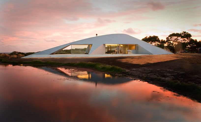
The Croft House on the South coast of Victoria near Inverloch, looks at first to be just another overly literal expression of nestling into the rounded landscape, to protect against the aggressive prevailing winds from the Southern Ocean.  But it is much more instructive than that.

First is the realization that while the curving form is a rich interaction of both concave and convex roof structures, they have been disciplined into two-dimensional planes able to be constructed from conventional battens, rafters and corrugated metal. The iconic corrugated iron of Australian rural settlement is used to reinforce the notion of a rural, rugged shelter – a grey palette that also blends with the shale present in the area.  More generally, as briefly described in australian design review,

 “The building tells a story of place and the vernacular of local craftsmanship and materials. More broadly, the house also illustrates the sustainability of locally sourced materials with low embodied energy.”

The interior structure and joinery uses Victorian ash timber, while wet areas are clad in locally sourced bluestone.  Most interestingly, the passive solar design of the lightweight construction is not limited by the surface area of concrete floor slabs, but also utilises isolated thermal mass in the form of compressed sand thermal mass walls.  With double glazing, these minimise running costs. 

If there are jarring notes, one has to do with stereotypical expectations of isolated rural houses emphatically harvesting potable water from the corrugated iron roofs.  Australia’s only Pritzker prizewinner, Glenn Murcutt turned that expectation into an entire aesthetic language.  Here, in Stockwell's Croft House, the roofs touch the ground shedding water efficiently, but clearly not harvesting it for direct consumption.  The answer, for why this might be so, probably lies in filtration of water from the dam that figures so strikingly for aesthetic effect in the keynote photograph.

Another question that teases is why one of the hyper advanced solar cars from the bi-annual Darwin to Adelaide World Solar Challenge is casually, if inconveniently, parked next to the entrance door?  Does it imply that the owners of the house are particularly well connected in the photovoltaics research establishment?  If so, why is there no evidence of any photovoltaics integration in that extensive roof surface?  Or is there, in the form of thin-film PV laminates?

These kinds of more subtle technical information are hard to extract from the popular posts.  The architect’s own website provides a few more images for the Digital Detective, but no not enough to give clues to issues with no aesthetic traction.  Surprisingly, Dezeen provides the only quantitative data, as far as it goes:

"The project is of low embodied energy construction of local compressed sand walls and the entire structure and finishes are of local timber (both 0.5MJ/KG). The small material pallet is continued externally of grey zinc metal and concrete to blend with the muted shale geology. This shield like exterior makes for virtually no maintenance. . .
Running costs are minimised by double glazing, thermal mass and passive solar design. Large quantities of isolated internal thermal mass, high levels of insulation (roof and walls R6) and good cross ventilation avoids air conditioning and achieves high internal temperatures in winter.. . . The robust interior eliminates replacement of vulnerable surfaces and finishes."

Searching for more sources doesn’t yield too much information – except for the thumbnail plans on designboom – and simply reinforces the frustration of reading interminable quotations of the same few phrases from the architect’s press release.

See the original article in Dezeen, here.