Sunday 2 October 2016

Vertical forest 2.0


There must be something in the air.  Well, there is....lots of air pollution in the many cities around the world eating up their hinterlands of agricultural land and forest remnants.  In reaction, we have witnessed an increasing number of projects to reintegrate greenery with buildings at both urban and building scale.

Urban forests can help establish green corridors.  Green roofs can add a bit more vegetation.  But by definition, it is difficult to replace the net surface area of plant material found in natural forests, when so much area is dedicated to roads and other impervious infrastructure, and walls, glazing, PV panels or water harvesting roofs on buildings.

The only chance we have of 'multiplying' the green surface of a given piece of land is to put plants on the vertical facades of buildings.

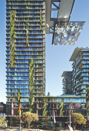
That thought was given very literal interpretation most famously in Patrick Blanc's green wall at the Museé du quai Branly in Paris, and later at 1 Central Park in Sydney.  Such 'green walls' – and others less famous both before and after – represent an approach which is a close simile to the fragile ecologies of cliffs in nature.  As a consequence they are vulnerable to disruption both natural and (for lack of a better word) administrative.  For instance, the greenery on 1 Central Park is looking decidedly ragged because of the natural forces of wind and sun, but it is even more threatened by the reluctance of the owners of many apartments to contribute to the expensive upkeep.  In my view, that kind of green wall will only ever make a small, perhaps negligible contribution to greening the city.

There is another way.  The pioneering example is Bosco Verticale ('vertical forest') in Milan.  When I first posted about that project, it was in the context of my cynicism about the fashion of photoshopping lush greenery on every skyscraper competition entry.  To support my doubts, I marshaled the reasoned criticism of  Tim De Chant who concludes that there are a couple of orders of magnitude difference between the effort required to achieve nominal tree presence on buildings as opposed to that spent on resuscitating the region’s natural habitat. But without repudiating my previous opinion, I have come to see the point of the vertical forest approach.

The difference between 'green walls' and the 'vertical forest' is technical, but simple.  Where the former relies on a thin veneer of plants supported by a thinner scaffold of growing media in mats or pots, the vertical forest approach sets out to create substantial volumes of soil in which to plant shrubs and trees.  The penalty is the extra weight to be carried by the structure, but the benefits are greater.  As with thermally massive construction, you have the inertia of both temperature and moisture regimes, that make the system much less vulnerable to exposure.  Even the issue of the extra weight is not so problematic, given it's dead weight acting vertically, the most easily resisted load on a structure. The sort of large structural planters used on the lower terraces of  WOHA's Singapore Park Royal are arguably a sub-set of this vertical forest approach. 

As with most pioneer schemes, the Bosco Verticale projects a single emphatic image, distributing its green terraces relatively uniformly over the building.  What prompted this post is a recent project announcement in Brisbane, Australia, where the balance between the conventional window wall surfaces and the part of the facade given over to the 'forest' is actually quite different.  In fact, so different, it would be easy to jump to a conclusion that the green parts are tokenism.

Closer examination of the scheme reveals  a subtly different reasoning.  The primary motivation is explicitly that apartments should 'feel' like houses in a garden, rather than more ambitious objectives of replacing larger ecological systems.  To that end, the architects respond with a simple apartment layout that maximises the apparent interface between the repeated two storey planted 'courtyards, and adjacent interiors.  Arguably, the precedent for this is Correa's Kanchanjunga Apartments in Mumbai, India, but with plants, rather than walls.

Developers may still begrudge paying for part of their building included more for the plants, than for the measurable occupied spaces.  And regulators may be slow to avoid penalizing the extra space within the built volume.  It may still be a pale imitation of nature in a real forest, or even in a good urban park.  But this latest example may be an effective demonstration for how to integrate elevated greenery that is both more robust and more economical than the green wall prototypes. If so, we can expect more people willing to pay a premium for their houses in the sky, with at least an illusion of arcadia outside their high rise windows.

See the Architecture & Design article here.

My previous posts:
Wrong green
No trees please.
Trees in the air 2

Tuesday 20 September 2016

The root of a housing crisis: we’re building the wrong thing

I am not sure to what degree this problem is relevant to the rest of the world, but it is an urgent discussion in relation to Melbourne and Sydney, Australia.  Writing in the Conversation,   of the The Australian Population Research Institute leads off:
As is well known, the shortage of affordable separate housing in Sydney and Melbourne means that most first home buyers and renters cannot currently find housing suited to their needs in locations of their choice.
Summarily setting aside the building industry's insistence that the market will continue to demand more apartments for small or single person households for a younger demographic, Birrell suggests the contrary conclusion.  His research suggests that in the medium term, immigration in particular will drive a greater need for homes for family formation.

But then Birrell criticizes current industry and academic research for using crude extrapolations of present assumptions about dwelling types, only to do exactly the same himself. Simply put, he assumes that family formation will continue to be identified with single detached dwellings, regardless of their decreasing share of the new build housing stock, and the continuing loss of older detached housing for apartment development sites.

A more sophisticated analysis would acknowledge that, as the populations of Sydney and Melbourne recognise the advantages as well as compromises of genuinely urban city living, there is likely to be a very significant growth of demand for family accommodation in apartments.  If that simple proposition is reasonable, then Birrel's headline still holds true, but for a subtly different reason.
The problem is not that we are failing to build single detached dwellings in places families want to live now.  The real problem is that all the best sites where families will be happy to live in the future, are being more or less permanently rendered unavailable for larger apartments.
It has to do with the nature of the land title for ownership of apartments in Australia.  Title is overwhelmingly the fragmented 'strata' title, where once a building is subdivided into individual apartment lots for sale, it is extremely difficult to re-consolidate, or even to reconfigure.  Profit in the current Sydney and Melbourne markets is maximised by building an overwhelmingly large proportion of single bedroom and studio apartments.  And there seems to be no truly effective planning instrument that prevents this outcome, with local government consistently unable to enforce its requirements for more forward looking mix of apartment sizes.

Read the Conversation article here:
https://theconversation.com/the-root-of-sydney-and-melbournes-housing-crisis-were-building-the-wrong-thing-49940


Saturday 17 September 2016

Complex urbanism

To give this piece its full title: Complex urbanism wears simple, at times casual clothes.


I am no longer actively teaching architecture, but sometimes I still feel like getting a message off my chest.  And so it is with some thoughts about Jean Nouvel.  Nouvel seems to conjure up some extraordinary pieces of architecture distinguished by uniquely simple diagrams.  Which to my mind, are too rarely remarked on.

Yes, the seminal Institut du Monde Arabe was justly famous not only for its remarkable dynamic abstraction of mashrabiya screens as mechanical irises, but also lauded for its resilute geometric solution to a difficult gap in the Paris built fabric.  That clarity of thinking is no longer easy to recognise.  For me the overall scheme is disappointingly disfigured by the major additions filling in the plaza, and now stomach bumping with a banal billboard the Notre Dame across the river.

But Paris has been good to Nouvel, and he has been good for Paris.  He has twice employed the same fundamental strategy for inserting museums as 'pavilions in a garden', while also healing gaps in the city's characteristic block perimeter facades.  

As a way of turning the diagram into built form, its almost simplistic: run a gossamer thin glass screen to the height of the adjacent buildings, and enjoy the freedom of laying out your building in the sequestered landscape behind.  The Fondation Cartier in Paris from 1994 established the trope.  But while the building behind is a thoroughly enjoyable modernist glass ensemble, it arguably holds no further profound lessons for the architectural pilgrim.

Its next manifestation, in the Musée du quai Branly you find the same diagram for the screen and the garden, but also a richer vein of arguably interesting thinking.

First, there is the misdirection.  That famous green wall seems to be the first and often only image associated with the Branly in many articles and web entries.  In life, it turns out to be the facade of the minor, administrative wing of the museum. Its real function seems to be to respectfully extend the corner from the Avenue de la Bourdonnais, at just the right height, and just the right weight.  The greenery allows Nouvel to compose the facade with a different rhythm and scale to that of the apartment buildings, while minimizing any clash that would otherwise occur.  Importantly, that facade is just as long as is needed to anchor the corner, and no more.

The real urban work is being done, as in the Fondacion Cartier, by the inscribed glass screen, forming the perceived edge to the remainder of the block, while revealing the garden behind.  

In this garden, the much larger museum building wallows like a beached whale, stitched together by an internal armature for which the declared analogy is a river.  Regardless of what that sounds like, I actually mean it as a compliment.  Like Frank Gehry when asked 'why?' about his Barcelona fish restaurant, Nouvel is entitled to say 'why not?'  This lesson is simple.  Almost any analogy will work, if the architect extracts from it its essential organisational or expressive potential, rather than render its superficial connection to site or context.  And if in design development the analogy doesn't work out, a good architect abandons it, gets rid of it, and starts with another, better one.

But for me, the biggest lesson is what is hidden. Therefore I learnt it not from experiencing it directly in the museum.  I have never come across anything more than a cursory mention of the artists in residence studios, that occupy the apartment buildings on the Avenue de la Bourdonnais.  No diagram, no plans, no images.  Yet that is where, I infer, Nouvel makes one of his profound departures from the modernist idiom.  

If I am right, I figured it out staying in a semi-basement apartment in Paris, accessed tortuously, like the famous sequence from Mon Oncle, but more dark passages than irrational stairs.  At the end of that transit was the apartment, almost miraculously opening a shuttered window back to the quiet courtyard.  It was a great place to come to rest and enjoy.  It didn't really critically matter how you got there, as long as the 'there' lifts your spirit. 

The proposition is that for personal and domestic places, the delight at the destination does benefit from the romantic, almost secret path.  But it needed no clarity of the 'parti'.  And so it is, I suspect, with the artists' studios.  See that 'mess' where the new museum building collides with the back of the apartment blocks?  I am pretty sure it was made that way.


Friday 16 September 2016

Shallow Manifesto


Sometimes you just have to laugh. But not because the piece of architecture is funny ridiculous. Rather, because perhaps it does something relatively simply and very, very well.

In this case, Manifesto Architecture dressed up a former gaggingly bland building in the otherwise chaotic Myeongdong district of Seoul. A showy bit of retrofit, mainly for a global fashion brand, but with an intersting, if simple twist.

To quote ArchDaily:
The process of M-Plaza's "volumization" can be described in three steps, each with increasing intensity. First the glass curtain wall was etched with a ceramic frit pattern inspired by stacked cubes giving the smooth facade an initial charge of volume. Then a grid of vertical and horizontal extruded frames was installed to divide the facade into a set of puzzle pieces each 500mm deep.

Finally, a series of “funnels”, new glass openings framed by sloped stainless steel panels that take full advantage of the 500mm depth achieved by the extruded frames, are plugged into various puzzle pieces. These three architectural languages give the facade a greater level of depth and dynamism, but are applied in a consistent manner over the large facades allowing the irregularities to exist within a certain boundary of order.
At first reading, it sounds pretentious. One way of putting it is that this is hardly a profound piece of architecture. Another way of seeing it is to recognise the way the architects applied their core skills of formal, compositional, programmatic and spatial, within an extremely constrained set of limits.

Manifesto Architecture deserves to be taken seriously, with a significant body of work, both built and rhetorical, that spans the scale from wooden cutlery to monumental buildings.

I feel guilty for the cheap shot of my title for this post.

Read: http://www.archdaily.com/556223/m-plaza-manifesto-architecture/

The other robot revolution: Prefabrication 2.0

Australia’s tallest prefab tower tops out at double speed

This recent headline in The Fifth Estate suddenly brought into the spotlight a quiet development in the Australian construction scene.  I first posted about the Hickory Group's  One9 apartment tower in Melbourne, utilising their so-called Unitised Building (UB) System in Too good to be true? back in 2014.


Developed and championed by Australian architect Nonda Katsalidis, the UB system relies on factory-based modular construction with high levels of external and internal finishes and fit out, making for fast on-site assembly.  It claims, and with ongoing development, clearly delivers the big advantages of modular prefabricated construction.  Chief among them are the improved safety and working conditions for the skilled workers who put together the modules in a factory rather than on site.

Less easily accessed is information on the new balance between manual production line work for those human workers, and work performed by the robots inherited along with the defunct car manufacturing facility, in which the new building manufacture is located.

Tuesday 2 August 2016

Gehry in Sydney too


On the occasion of its opening, I posted a lengthy piece about the Dr Chau Chak Wing Building at the University of Technology Sydney.  

My emphasis was on the remarkable way in which Gehry adheres to a highly disciplined, almost simplistically rational diagram, while producing wildly innovative sculptural buildings.

The first part of that proposition went down like a lead balloon, in the midst of much bluster by local critics and architects.

Now, looking for something altogether different, I come across a thoughtful article which actually pre-dates my piece, and about which I wish I had known at the time.  The title says it all:
Look past its facade: new UTS business school designed by Gehry from inside-out

Of perhaps greatest interest to me is the claim that the project is 'Australia’s first true 3D-documented building'.  We hear often enough of Gehry's use of Digital Project, the 3D design tool developed by Gehry Technologies as an overlay of the original Catia aircraft design software.  But we rarely have enough of a description of its consequences in how his uniquely complex buildings are tendered and built.

This easily read article adds welcome additional information, images and a video.  It should give anyone who is interested a significant extra understanding to Gerhy's success as arguably the most interesting architect alive.

I am also happy to report that the architectural tourist will be amply rewarded seeking out the building - the University keeps it surprisingly open and accessible.  You can indeed look behind the facade.

Friday 1 April 2016

Vale Hadid

I woke up to receive my first news of the untimely death of Zaha Hadid, via Inhabitat.  Never carefully accurate, the Inhabitat reporting listed amongst Hadid's achievements the design of the London Olympics Stadium.  Small matter, but of course, Hadid did not do the London Olympics Stadium.  That was done by  Sir Robert McAlpine and Populous, taking an approach to sustainability which it is unlikely Hadid would have.  Her firm did the swimming and diving venue, with the famous controversy over restricted sight-lines.

Hadid will receive scholarly and personal obituaries commensurate with her stature, so I will not attempt one here. 

Zaha Hadid is a great loss; she has exerted a very large influence over contemporary architecture.  I tried very hard to admire her work, but it is likely she will be remembered with mixed feelings. 

If it can be said that the modern movement brought itself into discredit because of its adoption by developers and architects of lesser talents, Hadid's seminal formalism is being brought into disrepute by the shoddy examples produced by her own firm.

Sunday 3 January 2016

Had it with Hadid


I've been waiting for more images to emerge of the Guangzhou Opera House.  They have.  Look and weep.


This from a practice that supposedly employs world-class 'parametrics'.  I could have offered them any number of second year architecture students who understand that the point of 'meshing' a complex surface is to resolve the joints and nodes in the simplest, repetitive way....and that you don't impose an arbitrary 'tessellation strategy' which is guaranteed to defeat that potential.


If the problem were only that , painful as it might be.  Is there any excuse for the shoddy mess at the level where you 'touch' the building?  We have been doing that sort of stone detailing since the Greeks.  It's convenient to blame the rapid evolution of the Chinese building industry for the lack of skilled trades.  But it's not enough to explain why more of the architectural effort hasn't gone into 'designing out' the problems.

There are innumerable short essays and image galleries available now.  Just Google 'Guangzhou Opera House failures'.  The authors generally bend over backwards to be 'fair' to the architects.  I don't know why.....I am with Larry Speck (former dean at the School of Architecture at the University of Texas at Austin) on this one:
"Architectural Record recently gave Zaha Hadid’s Guangzhou Opera House its Best Public Project: Honor Award in the Good Design Is Good Business: China competition and published it on the cover. http://archrecord.construction.com/ar_china/China_Awards/2012/Guangzhou-Opera-House/Guangzhou-Opera-House.asp

Unbelievable! I visited the building last January and was absolutely dismayed at how inept and poorly designed it is. Had anyone from the awards jury (which “included editors from Architectural Record and respected Chinese architects and experts”) actually visited the building? If so, I cannot believe they would consider it “good design.” The building’s failures are glaring and are certainly no secret. The fellow showing me around in Guangzhou did not want to take me to the opera house because he was “ashamed” of it.

The photos in Architectural Record do look dazzling—proof again that photos can be made to lie. The images are dominated by distant views and night shots that obscure the building skin.

If you were an arrogant westerner it would be easy to say that the embarrassing crudeness of the building is not the architect’s fault, but the result of a Chinese building industry not yet up to the visionary imagination of the designer. But that notion is belied by the fact that within view of the opera house are the extraordinary Guangzhou New Library by Nikken Sekkei, the Guangdong Museum by Rocco Design and the Guangzhou Tower by Mark Hemel and Barbara Kuit—all of which are ambitious, meticulously designed and beautifully executed. The problem at the opera house is poor design.

Is it possible to create curvilinear forms with very tight radii, superimpose a series of triangular grid patterns, make the building out of a very heavy, brittle material like granite, and realistically expect any sort of success? These seem to be ill-fated conceptual directions. When things very went badly awry, fat caulk joints apparently were the universal solution to poorly resolved design.

The interiors have the same kinds of problems—chases that seem to have been added as an afterthought, indirect lighting imbedded in sumptuous glass-fiber-reinforced gypsum forms where the faceted T-5 fixtures are clearly visible because no one checked cut off angles to be sure the lamps would be concealed.
Promoting clearly flawed design as the “best” we have to offer is demeaning and makes us look ridiculous to people outside the architecture subculture. This is how we lose power in the larger society and become marginalized as a discipline. Elevating “stars” and “signature design” at the expense of deeply rooted and rigorous standards of excellence does a disservice to our field."