Friday 29 March 2013

Going broke - the chronic problem with builders

Architecture is the mother of the arts. Yea. Architecture can exist in the realm of ideas, for years or forever, without a single built example. Yea.  Yada, yada, yada.
All else said and done, architecture exists when it is built, to be experienced in concrete 3D and the passing of time.  Architecture is not even just the finished object, but the whole process of procuring it, and launching it into its independent life.  Architects need to understand how that happens.  They need to understand, amongst other things, the chronically precarious nature of the building industry, the people and businesses that turn the ideas and the wheeling and dealing into buildings.
So it was with great interest that I read a series of interconnected articles, on the perceived need for major changes in the building industry to avoid the frightening rate of insolvency.  The discussion nominally centres on my home state of New South Wales in Australia, and therefore may not accurately reflect either the legal, or structural features under which builders operate elsewhere.  But I suspect that the core of the problem is recognizable nevertheless.

Simply put, building contractors generally can't pay their bills, until their own invoices are honoured.  As that is most of the time, in any jurisdiction that makes trading while insolvent a crime, the contractor should immediately go out of business, or at least be placed into voluntary administration.  Clearly, it can't be that simple, but on the other hand, it explains a lot about the sector, and it sounds bad.  Until you think of the knock-on effects; then, it sounds terrifying.  You realise how many creditors a construction contractor is likely to have, and what immediately happens to those sub-contractors and material suppliers.  The picture gets worse when you think further.  Depending on the scale of the project, some of those creditors can be big development/construction companies in their own right, who may be driven to the wall by a problem with one project, thereby leaving many otherwise healthy projects in dire straights.

Indeed, NSW Finance Minister Greg Pearce has spoken of the enormity of the issue:
“Between 2009 and 2011, hundreds of companies in NSW collapsed owing billions of dollars, slamming the brakes on vital projects and investment...Up to 24,000 unsecured creditors, including suppliers and subcontractors, have been left out-of-pocket, some by millions of dollars.”

Of course, any proper review will reveal other individual and systemic problems, such as shoddy financial management, under-quoting in aggressively competitive tenders, exploitation of employment and contract labour arrangements, even criminality.

No wonder that the peak bodies in the industry are calling for urgent review.  The rest of us should be vitally interested, because, surely such a flawed system is not sustainable.

For a pretty straight forward discussion of the issues, it is worth reading:
NSW Construction Inquiry After Major Insolvencies
Act Fast, Act Soon to Avoid Insolvency
NSW: Huge Need for Change to Prevent Construction Insolvencies
How Did 1,862 Construction Firms Fail?


Wrong green

This is an update/re-write of a post that lost its links.

Wish I had got my brain in gear long ago, and done it myself.  In a short but effective article by at Slate, titled
Can We Please Stop Drawing Trees on Top of Skyscrapers? finally someone has taken the trouble to state the obvious:
Architectural design proposals often depict high-rise buildings with trees flourishing on rooftops in an attempt to look more ‘green'.  Despite this, trees and skyscrapers are a lethal mix – for the trees.  Regrettably, trees rarely survive on the top of skyscrapers, undercutting ideas of including them as a nod to sustainability and environmental friendliness in the renderings.
The article sets out the fundamentals: extremes of temperature, destructive wind velocities, and the immediate threats they pose to the normal biological functions of trees – from structural stability, to delicate osmotic gas and vapour exchanges in the normally protected boundary layer of air.  Anticipating the logistical difficulties of maintenance is not exactly rocket science, either.

The case against trees at great heights is easy to make, and is contrasted with the relatively easy path to conventional roof gardens on lower rise, high density apartment buildings..


Thursday 28 March 2013

Shipping containers 1

I have been ignoring one of the more interesting sustainability initiatives in architecture for far too long.  There might be something counter-intuitive about the idea that butchering shipping containers to build houses, is a particularly admirable thing to do, rather than reusing them for their intended purpose.  But it is a fact of life that world trade is hugely asymmetrical.  It is uneconomic to ship as many empty containers back to source countries, as arrived fully loaded.  So, the bottom line is that there are very many shipping containers being stockpiled, and available for reuse.

It might therefore seem slightly ironic that my first example, in what I intend to be a series of posts, should actually be about an exemplary design for a single dwelling, in China.

The WFH House, designed by Copenhagen-based studio, Arcgency  is made of three stacked shipping containers.  It comes immediately obvious that the containers are used primarily for their structural function, and that there is considerable additional work in both external and internal finishes.  There is also a catalogue of other sustainability initiatives, that have little or nothing to do with the genesis of the project as recycling containers. According to the designers, the house was:
designed to produce more energy than it consumes through the use of upcycled shipping containers as a steel frame, a sustainable bamboo facade, a rainwater collection system, solar cell-clad green roof and permeable paving.”
Thinking of the house in this holistic way makes it much easier to appreciate the direct gesture of the big skillion roof, superimposed on the simple support of the three containers.  Also thinking beyond the simplistic, one realises that by separating the containers and roofing over the void, nearly half the external surfaces of the shipping containers become the framing of interior walls, rather than exposed to the weather as part of a more pixelated composition.  Not only does this produce cheaper volumes of habitable space, but it simplifies reliable weatherproofing, and maximises the chances of a house like this fitting with more conventional neighbours.  All of these considerations come legitimately within more subtle sustainability thinking frameworks.

I found one of the better collections of pictures on freshome.com,  As usual, images of construction and other systems figure less than interior decoration, but patient scrolling down a few screens does have its rewards.  To read more, go to the article here.

Next time, an exemplary project by Phooey Architects in Melbourne, Australia, which you cannot mistake for anything but the obsessive use of every bit of the original shipping containers.


Tuesday 26 March 2013

Boys' toys

As reported by a number of architectural news sites, a 388-metre-high hotel and apartment building, which will be the tallest building in the southern hemisphere when completed, has been granted planning approval in Melbourne, Australia.  'Australia 108', designed by local architects Fender Katsaladis is to be built in the Southbank area just a few streets away from another iconic residential skyscraper by the same team, the 297-metre-high Eureka Tower (seen in the foreground of the image at left).

Predictably, the relevant details are scanty.  The proposed accommodation is predominantly residential apartments, but with a few floors dedicated to a six-star hotel.  The different program of the hotel, and an apparent requirement for an easily grasped simile to describe its form, gives the architects the excuse to burst the skin of the otherwise extruded tower, with cantilevered triangular forms that would be legible as the 'Commonwealth Star' of the Australian flag - if they hand out building plans to those who stay there, I assume.

Piecing together diverse sources, most of which report the same press release, does yield a few relevant additional pieces of information.  The construction is intended to be a proprietary prefabricated system developed by Nonda Katsilides, who has also been involved as the developer on many of his previous key projects, as he is here.  It will be interesting to watch if the construction achieves the efficiencies and accelerated completion predicted.  The overshadowing issues with such a large building have been generally discussed only in terms of whether the long finger of darkness will reach as far as the local war memorial, but they are brought together with predicted adverse wind effects by a local academic critic, questioning whether the approval of a number of skyscrapers in Melbourne will be good for that city's urban environment.

From my perspective, as usual, the available information doesn't address core concerns.  So, for instance in relation to the likely environmental outcomes at street level, I am not so much interested in lining up with the critics in predicting disaster, as with the fact that nobody seems to consider it appropriate to conduct good wind tunnel and CFD studies - or if they have been done, to make them available to answer such questions.  Nor is there any mention of energy efficiency, or any other sustainability considerations in relation to the proposal; in this day and age, that alone is almost unforgivable.

To be honest, no single news item deserves to be privileged with a final link here.  To read more, and to see more images, one might as well google 'Australia 108'.  To go to the project's vacuous web site, click here.

Saturday 23 March 2013

Help me out here: does this exist?

I have written before about my periodic, perverse Google searches for the world's most sustainable building.  This month, the front runner appeared to be the Wuhan New Energy Center (also called the Wuhan Energy Flower), in China.

My problem is that the earliest article to which I linked was the announcement of the competition winners, Netherlands-based firm Grontmij, in collaboration with Soeters Van Eldonk architects, in June 2010, while the latest verbatim copy of the same press release dates from almost exactly two years later.  The Sustainable Cities Calendar from 2011 claims construction began in November 2010, but even for China, that would have been fast tracking.

I have used any possible search terms to get me to something concrete, including filtering for actual photographs.  All I get for my efforts are innumerable instances where the photorealistic visualizations are described as if they were taken by a camera.  The Pinterest boards about Architecture, in particular, seem to live in an alternative reality where photographs and renderings seem indiscriminately interchangeable.

This post I am not even trying to add any particular original insight to any discussion of this building.  My purpose is very simple:

Is there anyone out there who can point me at any evidence, of what happened to this utopian vision?

Surprise. Surprise. Mandatory disclosure in New York

Sometimes it takes me a while to catch up with something quite important.  And to be completely truthful, I wouldn't have caught up with this one, but for an item in GreenBuildingsAlive, a fine, 'long-form writing' blog I don't read nearly as much as it deserves.

Late last year, the New York Times carried an article on the results of the first mandatory disclosure of energy efficiency scores for commercial buildings.  It had a few surprises.  Chief amongst them were the unflattering comparisons between some newer buildings that have trumpeted high LEED ratings, and older buildings.
"In courting tenants over the last six years, 7 World Trade Center has trumpeted its gold LEED rating, an emblem of sound environmental citizenship.  But when it comes to energy efficiency, the young 52-story tower . . . had a score of 74 — just below the minimum of 75 set for high-efficiency buildings by the federal Environmental Protection Agency’s Energy Star program.

On the other hand, two venerated show horses from the 1930s, the Chrysler Building and the Empire State Building, sailed to an 84 and an 80 as a result of extensive upgrades of their insulation and mechanical systems."
Of course, the situation overall is much more complex, and the article makes a remarkably good job of explaining this complexity.  Reporting the more obvious explanations, like:
"Older buildings tend to have higher Energy Star scores because they have thicker walls, fewer windows and less ventilation — superior “thermal envelopes,” as a report on the early results puts it. They are also less suited to energy-gobbling activities like computer data crunching, the downfall of some youthful but middling performers."
the discussion moves on to the more subtle policy purpose of identifying buildings with the most opportunity to improve.  As the article points out:
"The stakes are considerable. Unlike cities that depend heavily on automobiles, New York racks up most of its carbon dioxide emissions — nearly 80 percent — in heating and cooling buildings. Tracking this energy use is deemed crucial to meeting the city goal of cutting overall emissions by about a third by 2030, to slash costs and fight climate change. "
 And there lies one of the less well exposed, or perhaps poorly cross-referenced details in an otherwise well informed commentary.  However admirable a 2009 law requiring progressive adoption of mandatory disclosure, however sound the approach to market transformation, cutting emissions by 30%  is actually a bit of a cop-out.  I say this not as some sort of intemperate judgmental rant, but simply to point out that the 2030 Challenge to which so many city mayors in the US have subscribed, sets far more ambitious goals.  Still, you have to begin somewhere, and proper, public disclosure, with a suitably reported detailed analysis which does not allow simplistic interpretation, is definitely a good place.

To me as an architect of a certain generation, there are other perhaps predictable, but still shocking factoids, mentioned in passing.  My favourite?  On a scale topping out at 100, "the Seagram Building, Mies van der Rohe’s bronze-toned 1958 masterpiece on Park Avenue, posted a 3."  I shouldn't be surprised.

Read the NY Times article here.
And if you are up to it,download the whole 36 page NEW YORK CITY LOCAL LAW 84 BENCHMARKING REPORT in PDF format here.

Thursday 21 March 2013

The man who wasn’t there

My posts about the Opera House have taken on a life of their own.  These things happen.  I shouldn't have been surprised that what is arguably the world's greatest building of the 20th century, wouldn't allow me to get away with simplistic fragments of it's story.

So it is that friends have pointed me at a new article by Sylvia Lawson in INSIDE STORY, from which I draw my title.  The author has been for many years one of the key players in uncovering the complexity of just how such a grand enterprise of public architecture is realised.  In this article though, it is not so much her own contributions that figure, but a critical summary of parts of a truly grand media production, The Opera House Project from Australia's ABC.

I wish I had known that this monumental multitrack film production was publicly accessible since late last year.  Definitive in its access to archival material, and remarkable in its production values, The Opera House Project is compulsory viewing for anyone interested in high culture and the role of the democratic state as its patron – much the less for any young architect with stars in their eyes, trying to come to terms with the bizarre flowering of public architecture around the world at this time.


To be honest, I am so humbled by the sheer density of both Lawson's article, and that of the linked online television resource materials, that I feel I have very little to say.  Other than to point you at each of them.

Read Lawson's The man who wasn't there in INSIDE STORY here.
To go to The Opera House Project, click here. But make sure you have plenty of time; you won't be able to tear yourself away.

Saturday 16 March 2013

At last, Dezeen has an opinion

I reacted badly to the opinion piece by Marcus Fairs, the chief editor of the archi-pop site dezeen, when he ventured "Sorry green design, it's over" some weeks ago. 

So it was a pleasant experience to read his most recent piece on gated communities as a solution to the fears and insecurities of more affluent residents, in the many places on earth where crime and lawlessness are perceived as pervasive.  He navigates the issues with enough subtlety to engage a reasonably intelligent reader, and though the conclusion of the piece is fairly noncommittal, Fairs' article does good service in making sure that those issues remain at the forefront of our thinking when we examine and compare the burgeoning cities that are mankind's crowning design artefacts.

But the real benefit of my revisiting Dezeen's opinion column was in fact the back link to the first of the series, from which my title is drawn.  I had not realised that Dezeen had deliberately eschewed opinion for the first six years of its life, and had actually just reintroduced opinion pieces this last January.  That introductory piece is a straightforward personal explanation, but also an elegant commentary on some of the same concerns as I have, of how online information available about design – and architecture in particular – contributes to our understanding of it.

Fairs briefly traces the erosive influence of the internet on the long form journalism, and clearly identifies the dominant problem as the obliquity of information – "if you Google a phrase from an architect’s press release you will find the exact same wording on dozens of sites".  As part of his rationale for reintroducing 'serious' writing now, he offers this interesting insight:
......Google, so long viewed as the nemesis of good writing since it seemed to promote quantity over quality, has started to act as its saviour. Since its Penguin update last year it now marks down sites that publish generic content while elevating those that create their own. Now, instead of a race to the bottom there is a race back to the top.
If Fairs is right, I do look forward with greater hope to the resolution of my despair with the current state of design commentary.  Clearly, it is going to be a patchy road with some of the newly higher ranked pages merely original (like the premature report on the death of green design), but hey, even jaded journalists have to start somewhere.

Read the piece about gated communities here.
And the introduction to the Dezeen Opinion Column here.

Wednesday 13 March 2013

It's probably architecture

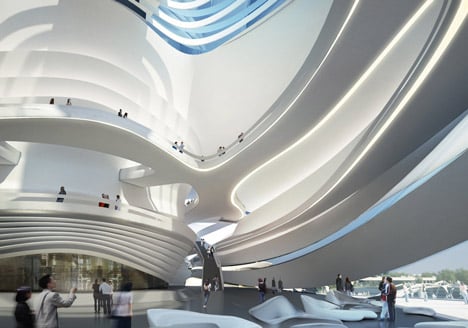
The latest large scale work by Zaha Hadid to feature heavily on archi-pop sites such as Architizer, Dezeen and ArchDaily is the Changsha Meixihu International Culture and Art Centre.

Architizer's headline Zaha’s Changsha “Megaplex” Is More Zaha Than We Can Handle hints at the possibility that this project, more than any other, might represent a tipping point.  But the actual tone of the article is sober and supportive, confining itself to a narrative that does no more than describe the formal development of the major components of this large complex.

In some respects, the published images indicate an architecture like many other proposals, by many other architects.  These works are clearly the products of visualisation software, and of the plastic sculptural freedom such software affords anyone who can lay out a rudimentary circulation diagram.  The illustrations are 'scaled' to human experience, by the same simple expedient as has always characterised architectural drawings: inserting the human figure in poses vaguely identified with the building program.  Any concern about the realism of the images as representing buildable prototypes is in the first instance answered by the now common knowledge, that the illustration software captures underlying geometric data which can be fed with little further mediation to fabrication software, in turn capable of controlling machines that automatically deliver suitable components at building scale.  There is no doubt that such buildings can be, and are being built.

So, do they represent the current parametric zeitgeist, a logical evolution of architecture outgrowing the artisan niche to which it was formerly adapted, or are there some other theoretical and practical implications that should be getting a better run in discussions on these sites?  Again, the first reaction might be that more profound theoretical examination is to be expected in the scholarly settings of books and academic journals.  Fair enough on the face of it, but a bit of a cop-out.

Even casual examination of the renderings suggests that their authors are simply not engaged in any rigorous anticipation of the built reality.  It isn't that hard to comment on the absence of material clues in these otherwise photorealistic renderings; the absence, rather than the dissolution of clues to what is inside and what is outside, the missing distinctions between surfaces formerly characterised as ground, wall, or sheltering roof.  More generally, this lack of coding of the layers of design intent leaves unanswered other profound questions relating to the life of the building, including how it actually achieves comfort and amenity, and whether it relies on sustainable supplies of energy to fulfill its most rudimentary functional tasks. The architects appear to be leaving that all to be somebody else's problem.

It is not a stretch to suggest that buildings like the Changsha Meixihu International Culture and Art Centre are the result of a relatively recent realisation – that really, almost anything is possible.  But is it good for us to leave that proposition hanging, without self-imposed constraints and qualifications?  Surely the theoretical discourse takes on an ethical dimension, in which even populist on-line magazines can engage?  Something to do with whether imposing on others the consequences of such wanton profligacy should be the dominant paradigm of public architecture?

Of course, there is much more to interrogating the theoretical underpinnings of an architectural proposal, than asking whether it is right or wrong to stretch budgets.  For me as a teacher, the implication of 'anything is possible' has very particular, everyday consequences – and many might be surprised that they are almost all negative.  Imagine trying to maintain a shared critical framework with a student, in which to communicate that not all is right with his or her developing studio design.  If students are seduced by Zaha in her 'anything is possible' mode, they have little incentive to accept such a critique.  While the concepts of 'right' or 'wrong' are contestable, to have no such concepts makes learning very difficult.


Monday 11 March 2013

Homebuilders cutting corners to save?

Image: James hardie Scyon™ Matrix cladding
Architecture and Design reports a lower profit projection by one of Australia's major building products manufacturers, with a back story that blames it on home builders cutting their costs to preserve their margins.  As that theme is developed in the article "Homebuilders cutting corners to save, says James Hardie", the underlying cause is defined as the dramatic increase in land prices for individual dwellings, squeezing the amount of money the aspiring owner has left over for building.

The quoted list of material substitutions, and lowering of construction quality sounds superficially plausible, but is actually constrained by building regulations.  Thus for instance, the systematic deletion of eaves on closely spaced two-storey houses is either a product of the smaller land parcels, or of historic cost cutting measures with their origins at least 20 years ago, rather than more recently.  But you can't argue with sources close to the supply chain, if they are indeed seeing the stripping out of higher value materials in the speculative home offerings.

What interests me more is that there is the barest mention of any move towards reducing the sizes of individual homes. It is as if the value management exercise was predicated on building the grotesquely large individual dwellings, on which I have reported before.  I do not want to rehearse again my distaste at the idea that Australians build the largest homes in the world. In fact, it is ironic that I was just thinking of writing a blog post defending the design quality of Australian McMansions.  I have long been bothered by the way that the architectural establishment and some of the design press have long conflated the poor sustainability outcomes of oversized houses, with an assumption that they are also badly designed, or of poor build quality.  But now I don't think I will bother.

Read the full article here.

But for sake of completeness, I should also mention that I wasn't entirely happy with the uncritical way that the title of 'biggest homes in the world' was conferred on Australia.  So I did a little bit of background research into the McMansion phenomenon.  

One of the more interesting snippets I found was an undated article by Christopher Solomon in MSN Real Estate, titled "The swelling McMansion backlash".  Interestingly, the American perspective highlights 'knock down and rebuild' in established affluent suburbs, rather than new estates on the urban fringe.  But it also talks about houses in the 400-1000m² size range, making the less than 300m² Sydney McMansions almost look small.  Why the discrepancy?  As usual, the first culprit is the use of statistics.  While the average Australian 'new build' may be the largest in the world, the Americans, as usual, hold a monopoly on the extremes.  But Solomon's piece offers much more of interest, and I may have to write a whole new post to do it justice.  Meanwhile, read the article here.

Sunday 10 March 2013

Sustainability and the suburbs

It's received wisdom that urban sprawl is unsustainable.  This is the message of an article in The Conversation, an Australian website dedicated to op-ed pieces by academics to bring ideas and research to the general public.

In "The Grass isn't greener in the outer 'burbs" Robert Nelson takes a historical analogy of court life concentrated on the palaces of Paris or other imperial capitals, and from it sets out a model of the Australian city – where, in his view, "power and privilege are concentrated within 10km of the city centre".  This leads him straight into a thesis that sprawl is singularly the product of the poorer segments of the population being forced outwards, by the reluctance of the privileged to allow inner areas of the city to be consolidated to greater density – and that those in the outer suburbs are thereby forever doomed to various inequities, which now require ongoing remedial compensations and subsidies.

Even if we accept some kernel of observed truth in this probable, but not uncontested key idea, Nelson comprehensively buries it with an overburden of stereotype and misconceptions.

His description of the development of the Australian city appears ignorant of its actual history.  Perhaps there are key differences between Melbourne (where Nelson is based), and Sydney which I know much better.  But the story of suburban expansion in Sydney is dominated from the earliest times by cycles of the wealthy moving outwards to Arcadian enclaves, while the walking distance to the centre is dominated by the growth of more humble, and denser dwellings of the working class.  As transport takes the pressure off walking, some of the original leafy fringe in turn succumbs to speculative subdivision,  and the wave of the wealthy moves outwards.  Thus the names of many of the mean, but picturesque streets of Balmain mark the grand driveways of the original estates, Newtown still hides the odd neo-Georgian square within its crust of much smaller terrace housing, and the grand federation subdivisions of Strathfield are reminders that the suburb was not always of humbler quarter acre blocks.  Even the far-flung expansion to the west beyond Parramatta was pioneered in the 1970's at least in part by members of the upper middle class, looking for sites big enough for the tennis court and perhaps the stables.  In this they repeated the earlier settlement of the upper North Shore, far beyond Nelson's imagined 10km limit.  Not surprisingly, the detail of Nelson's evidence is also deficient.  Australia's oldest private school for boys, the very exclusive Kings, is beyond Parramatta, hardly in the inner ring.

If there is now a marked pattern of concentration of money, power and privilege, or rather a diffusion towards the edges, it is the product of more complex factors – for instance, the development of the post-war settlement areas, very similar in outcome to the infamous 'little boxes on a hilltop' of Levittown NY.  My purpose here is not to describe those more complex dynamics; they are far too broad to attempt in a blog post.  I am merely upset that even in the supposedly high end of critical commentary, we succumb to the 30-second grab of glib over-simplification.

The venerable Pat Troy long ago pointed out alternative issues we must consider in the comparison of sprawl and urban consolidation.  Amongst other factors to contemplate is the insidious way that developers of higher density infill externalize the cost of expensively augmenting infrastructure – where governments categorize it as maintenance (in comparison to the cheaper capital works in the new subdivisions).  And we should not dismiss the possible resilience of the older quarter acre block suburbs, in the face of climate change and altered patterns of food availability. 

I am particularly upset that under the banner of championing sustainability, Nelson shrilly demonizes the urban fringe, while misrepresenting the actual situation of the inner areas.  I do, however, agree with him that overall, we have significant problems with urban sprawl, that they are a product of deficiencies in planning, and that those deficiencies are the product of willful ignorance and political expediency.

Read the original article here.

Wednesday 6 March 2013

Mine's bigger than yours

Since 2009 I have been living with the uncomfortable knowledge that Australians build the world's largest new dwellings. The typical size of a new Australian home hit 215 square meters that year, while the Danes were building the largest houses in Europe at 137 square meters, and the British stoically made do with an average 76m2.  And even that comparison masked the more frightening statistic, that the average size of a new free standing house in Sydney, referred to predictably as a MacMansion, was coming in at 263 square meters, or more than 100m2 per occupant.

So it is doubly sobering to be pointed at a site that documents the living conditions of some residents of Kong Kong.  As reported in DETAILdaily yesterday, a Hong Kong Chinese human rights organisation, the “Society for Community Organisation” (SoCO), commissioned a series of photographs of overcrowded living spaces in the city.  The photographic commission was in response to a piece that appeared in the Economist, which in 2012 rated Hong Kong as the world’s most liveable city. SoCO point out that the article did not appear to consider the plight of around 100,000 people living in just 4 square metres in what are known as “cubicle apartments”, created by subdividing already small apartments into multiple rooms.

I've only just returned from a quick working trip to India, where you still only have to scratch the surface of the newly clean metropolises of Mumbai or Chennai to discover the now less visible urban poor, for whom 4m2 of actual shelter would be paradise.  

So everything is relative.  But that shouldn't deter one from being outraged both at the unsustainable material profligacy of the developed world as represented by Australia's MacMansions, nor forgive the social unsustainability of the developed world, if its general well being still relies on some of its citizens having to do with so little.  

For more images of the cubicle apartments, go to the article in DETAILdaily here.http://www.detail-online.com/daily/cubicle-apartments-hong-kong-9965/

Winners for Green Square Library competition

The international competition, for a community library and public space in one of Sydneys most important regeneration areas, has thrown up a clear winner.  Young local architects Stewart Hollenstein, in association with Colin Stewart Architects offered a scheme recognizably different in ideology and architectural approach, and have been deservedly rewarded for it.  The winning design incorporates an outdoor plaza to create multiple sites for play, work and rest. Some of the buildings are below ground while bookshelves sit outdoors in the plaza. The design includes an amphitheater, a storytelling garden, water play zone and wide open spaces for festivals.

The overwhelming majority of the more than 140 other entries were desperately looking for some reason behind buildings as objects, with some of the narratives highlighting the arbitrary search for novel forms that characterizes contemporary architecture.  In contrast, the Stewart Hollenstein and Colin Stewart entry stood out even in the short listed schemes, for having a true appreciation of urban design as an emergent phenomenon.


During the second stage design development, when the identities of the short listed entrants were already known, the presence in the collaboration of the hugely experienced Colin Stewart must have given the jury comfort.  Colin started his urban design career as a student by being a runner up in the Pompidou Centre Competition over forty years ago, and was in the right place at the right time to grasp some unique opportunities for creating town centres during the development of contemporary Canberra.  But to put too much weight on that would be doing no justice to the other members of the team, whose progress through the Architecture program at the University of New South Wales always suggested they would be stars to watch.  The jury's citation says it all: 

"By far the most interesting and stimulating Stage 1 design and was unanimously agreed that it was simply the most appropriate proposal for this site."
For the jury's comments, and downloadable PDF files of the winning entry, go to the site of the City of Sydney here.

If you are enthusiastic enough, you can review all of the entries by downloading the whole collection at:


Monday 4 March 2013

Mysterious mathematics 2: The Sydney Opera House


I received a response to my recent piece about mathematical genius in architecture, specifically addressing the story of the Sydney Opera House.  The comments are too long, too interesting, and indeed too important to bury as mere comment under an innocuous article of mine.  So I thought I'd reproduce it here as a full post. 

The author, Nino Bellantonio completed his masters degree quite a few years ago, using the Opera Houes as his major case study.   At a time when some of the protagonists were still easier to reach than now, he spent a good deal of effort untangling the story from the myths that already surrounded the building and its architect.

Nino writes:

"Although not generally stated, I think there can be little doubt that Utzon’s competition design was strongly influence by the work of Spanish expatriate Felix Candela whose work in Mexico was in the air in the 50’s and 60’s.

Félix Candela worked to prove the real nature and potential reinforced concrete had in structural engineering. Reinforced concrete is extremely efficient in a dome or shell like shape. This shape eliminates tensile forces in the concrete.
Candela did most of his work in Mexico throughout the 1950s and into the late 60s. He was responsible for more than 300 works and 900 projects in this time period. Candela was influence by Gaudi, and many of his thin shell projects used the hyperbolic paraboloid geometric form (hypar).
Eero Saarinen, amongst others, was also using thin shell construction at the time. Saarinen served on the jury for the Sydney Opera House commission and was crucial in the selection of the now internationally known design by Jørn Utzon.  Saarinen arrived late, and a jury which did not include him had discarded Utzon's design in the first round. Saarinen reviewed the discarded designs, recognised a quality in Utzon's design which had eluded the rest of the jury and ultimately assured for him the winning entry.

The story goes that Saarinen was so influenced by Utzon’s design that he went back home and finalized his design for the the TWA Flight Center at John F. Kennedy International Airport.  Saarinen's design featured a prominent pointed wing-shaped thin shell roof over the main terminal where massing and shape of forms is similar to those first proposed by Utzon.  Of course Saarinen’s scheme is only two similar wing-shaped thin shell roofs balanced against each other, with side shells (also reminiscent of Utzon’s) linking them.  There the similarity ends.

Unlike Saarinen’s highly definable curvatures, where the visual pointiness of the arch is realized only at the edges, Utzon’s curvatures were initially freeform.  In Utzon’s original design the curves in space were much more complex and geometrically undefined.  The engineers at Ove Arup’s could not find a geometry to define them without destroying the initial intent.   

Parabolic forms were explored, more like Candela’s, but Utzon was unsatisfied, and model testing showed up structural deficiencies even with a double shell structure reinforced by ribs.  It was only after the shell structure was abandoned in favour of an internally folded roof structure that the breakthrough to a precast ribbed structure was made.

It was at this time that Utzon started to use the sphere of an orange to explain the solution.  Whether the orange inspired the solution is open to some speculation, but Utzon himself has often denied it.  The solution had great geometric rigour; an assembly of precast elements would replace the long contemplated in situ shell formation, and scaffolding would become redundant.  The breakthrough is recorded in correspondence from both Arup and Utzon, and was presented to the client in the famous Red Book.  A young Rafael Moneo assisted in developing the necessary mathematical calculations which resulted in a series of drawings and models of the final version prepared for presentation to the client.

Once Utzon had the geometry, he and Arups designed the individual elements, all cast from the same moulds.  The hard part in assembling the
jigsaw puzzle in space, was to find the exact position demanded by the architect’s geometry.

So, the real mathematical geniuses, if they need to be found, are the young site engineer Peter Rice, who was sent from the London office as one of the team endeavouring to calculate the shells and Hornibrook’s Peter Bergin , who had joined the construction firm as a chainman (because he had just failed his engineering exams at the University of NSW.

Peter Rice had moved to Sydney to be assistant engineer to Ian MacKenzie. After one month MacKenzie fell ill and was hospitalised, leaving Rice in total charge at the age of 28. On site his geometrical knowledge enabled him to write a computer program to locate the segments of the shells in space correctly.The surveying techniques were highly complex and required the use of backsights on known positions across the harbor and around the site. 
The laborious trigonometrical calculations were initially done by hand, but in the interests of speed, the whole procedure was dramatically updated and computerized.  In what were then even pre-faximile days, Peter Rice’s mathematical coordinates — converted by the young mathematical wiz from Hornibrook’s surveying team into computer code — were taxied across town to the AGE Company’s computer centre in York Street.  There they were processed into Cartesian and modified Cylindrical polar coordinates, and taxied back to the site office at Bennelong Point. 


The process, in the days of punchcards and room sized computers, usually took about one and a half hours.  If the sight readings were sent late in the evening, they would be ready for use next morning.  That this could be done so quickly was one of the marvels of computer applications to architectural and engineering works at that time.  That it could be done at all was due to Utzon’s geometry for the roofs.  Peter Bergin was able to carry most of the critical figures of the spherical geometry in his head, and could tell the errors revealed by the computer’s figures almost always by mental arithmetic.
Whenever necessary, these usually small errors could be rectified by the positioning of the next precast element.  Cumulative elements could be rectified by lengthening or shortening of elements, by a simple adjustment of the formwork.
After working on the Sydney Opera House for seven years, Peter Rice went on to work on the Pompidou Centre with Piano and Rogers, and later became Piano’s partner in an early incarnation of Piano’s Building Workshop where he remained until his death in 1992, at the age of 57.  History does not to my knowledge record what happened to Peter Bergin.

Utzon was working with similar geometries for the hall interiors when he resigned in 1966."


Acknowledgement:
The Peter Rice/Hornibrook story is mostly from John Yeoman's 1968  The Other Taj Mahal