Thursday 23 May 2013

What, exactly, is 'not science'?

When you see a title like Beyond Codified Comfort: Building Design and Performance, in a peer reviewed series of papers published in your local professional architectural association's award winning Environmental Design Guides, you expect a lot.

In fact, you expect at the very least a discussion that helps to bridge an important and threatening gap.  The gap is between our fragmented but conscientious policy initiatives to assure ever higher standards of building performance with the least environmental cost, and the traditional reluctance of the architecture profession to make use of evolving tools and knowledge that would help them to predict the likelihood of achieving those objectives.

Author Geoff Clark starts off on a promising enough note, with a critique of the architecture profession's fixation on the aesthetic.  He uses this not altogether new argument so he can isolate the issue that, in his words:
"While we concentrated on the building’s appearance, we chose to engage an ever-increasing array of consultants to do the grunt work for us. Structural engineers, surveyors, civil engineers, landscape designers, urban planners, quantity surveyors, project managers have all benefited from the abrogation of the architect’s professional responsibilities."
Clark's second major point is seminal to the topic of his paper, being a critique of the concept of 'codified comfort'.  He highlights the problem that "the legislative path to prescription of comfort has unfortunately robbed us of opportunities for other ypes of sensory stimuli because, in selecting for non-codified stimuli, we often compromise ‘performance’ of the codified components".  More originally, he distils the problematic societal expectation of 'more comfort', and the related reluctance to occupy built environments as a dynamic, active process of 'seeking comfort'.  From this, he establishes a platform arguing for both a greater resilience in designed buildings, and for a greater opportunity for architects to do that design.

The problem with the paper begins where the author tries to translate into action this intention to reinstate the role of design. He does this through a description of one of his design studios at the University of Tasmania, Australia.  That the project appears slightly simplistic as an exploration of 'geometry and disposition', and 'sameness and difference' is, I suspect, mostly a function of the limitations imposed by the format of the paper.  Let's just say I strongly agree with him when he posits that the function of such a studio is 'students are shown how to think, not what to think'.

But what emerges most strongly is that Clarke takes refuge in the old duality of art and science, and arguably thereby misses the more useful discussion of the unique nature of design offered by the likes of Edward de Bono. Particularly galling is when he makes the startling statement that his course "is designed to encourage students to apply logic, knowledge and understanding but not science to the problem of shelter." The italics are mine. 

The last time I looked, the Oxford dictionary definition of science was 'the intellectual and practical activity encompassing the systematic study of the structure and behaviour of the physical and natural world through observation and experiment' or 'a systematically organized body of knowledge on a particular subject' or even 'archaic knowledge of any kind'.  
So what distinction is Clarke really trying to draw?  Unfortunately, all he achieves is a sleigh of hand conflating science with some examples of technology.  More importantly in my view, he once again demonises the rigour that science demands.  He legitimises the sort of half knowledge that many architects insists should prevail in any rationale of their architecture. 
In doing so, Clark does less to improve the likely proportion of buildings successfully designed by well informed architects – whose knowledge and skills may transcend bad science – than entrench the reasons why so many architects design buildings that condemn their occupants to low-grade misery.

If you are not a subscriber to the Environmental Design Guide, the original paper is, unfortunately, only available for purchase.  The reference is:
EDG 74 GC • September 2012 environmentdesignguide.com.au
But for the sake of a blog, that is a bit rich.  So you can download a copy for free here.

Monday 20 May 2013

Junk Architecture

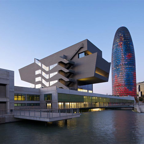
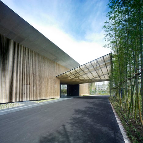
Sometimes the juxtaposition of two images, introducing articles on two different buildings is just so striking that it prompts you to commit to an opinion which you might otherwise hesitate to put out in public.  I had just such an irresistible urge, when once again viewing Dezeen, and seeing first an article on the new Design Museum in Barcelona by local studio MBM Arquitectes, followed closely by one on the Garden Terrace Hotel in Miyazaki by Japanese architect Kengo Kuma.

It might be a little unfair to compare such two dramatically different building types, but not if the main frame of reference is the way in which they represent different attitudes to urban design.

I find it fascinating that the headline image of the Japanese building is in fact its unadorned blacktop driveway, and the way that such a humble utilitarian fragment can speak volumes about the entire narrative of cities as a series of gradients from the public to the private, played out fractally at different scales.

In contrast, the Spanish museum looks for all the world like one of those metal toolboxes, serving  as some ill-conceived metaphor for its exhibitions, while its urban gestures of water, overlooking lawn and long, glazed events space are portrayed as clumsy and forlorn.

The supporting images of each project serve only to reinforce the contrast.  The delicate refuge of the Japanese, a jewel in natural materials and greenery, subtly manipulating spatial sequence, and making the most of its introverted courtyard; the Spanish museum in comparison like dumped aluminium junk.

Mind you, I am conscious that even a casual study of the plans included in the article on the Design Museum reveals that on the urban design front, the photographer has done no justice to the concept. His frame appears drawn irresistibly to the architecture as sculpture, or possibly to Jean Nouvel's phallic Torre Agbar office tower behind it.  Ironic that the photographer should be taking the images from the other side of the new 'lake', a more crafted bank with steps down to the water, affording choices of summer shade, if not complimentary sunny winter prospect.  The new Design Museum may not be junk architecture, but even after allowing for the photographer's poor choice of images, it still looks like it.

Read the articles at:
http://www.dezeen.com/2013/05/18/dhub-museu-del-disseny-de-barcelona-by-mbm-arquitectes/
http://www.dezeen.com/2013/05/18/garden-terrace-miyazaki-by-kengo-kuma-and-associates/

Friday 17 May 2013

Dezeen Despair

I honestly don't know whether to be grateful to Dezeen for the endless parade of projects large and small that they bring me every day, and that at least for some of those collections of pictures, for the plans and other drawings that they also publish.  Or, to give in to my recurring dismay at their complete lack of useful critical engagement with those projects.  The text most often runs the gamut from inane simile ('BLAH Architects designed a cabana shaped like an ashtray') to the plain non-committal.

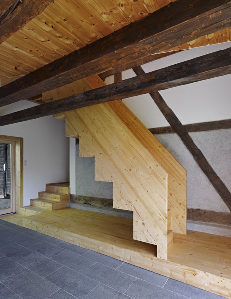
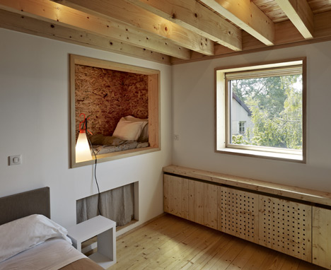
The latest to raise my ire is of the second type.  I am a fan of adaptive reuse, an admirer of new work sensitively added to the historic, of high architecture extracted from an apparent adoption of the vernacular, of clever, tight planning, of direct craftsman-like use of natural materials, everything that seems to have gone into French architect Loïc Picquet's conversion of an old farm building into a rural guesthouse in the Alsace.  It is instructive to view the article for the delightful, if far from comprehensive photos, but also for how little is the text that the editors have seen fit to attach to them.

I would have let it go, as I usually do, until one moment of pure irritation.  Disconnected from the image I reproduce below is the fragment of text that informs us "Floors are also wooden, while stable doors separate bedrooms from bathrooms and timber-framed cubbyholes contain extra beds and storage areas."

Those cubbyholes were for me the 'Aha!' moment when I was sure that the qualities I enumerate above were the stance from which Picquet is working.  After all, how often (outside Japan) do you see someone giving such literal form to Bachelard's most intimate proposition in his seminal 1958 book, The Poetics of Space?  It is something to be celebrated; from it flows the responsibility to to theorize the project, to at least critique it.

I don't really expect the on-line zeens to get better at this, though ones like Inhabitat sometimes surprise me.But sometimes, I just have to get my frustration off my chest.

View the original article here:
http://www.dezeen.com/2013/05/15/farmhouse-renovation-by-loic-picquet/

One Building, One City

It has been a while coming, and it has been difficult to believe.  The next world's tallest building will be in an empty field in China, it will be prefabricated and constructed in an unprecedentedly short time, and it will not be built primarily as an expression of financial power.

If you don't pay attention to detail, you might be tempted to come to the opposite conclusions, and classify it away with a lot of other hype.  But in fact, this is one of the most plausible, most genuine, most radical contributions to the transformation of the planet through a reasoned application of available technology.  The proponent of the scheme is a visionary industrialist who is putting his money where his mouth is, and equally importantly, has demonstrated the capacity to bring the project to fruition.

Sunday 12 May 2013

Bangladesh disaster

I'm morally obliged to link to one or other report of this awful tragedy.  While the deaths of three innocent people in Boston dominated our news front pages for days, this one was reported consistently around page five, and with few headline links on-line.

I therefore quote verbatim from Inhabitat:
"As the number of confirmed deaths from the deadly Rana Plaza building collapse in Bangladesh pushes past 1,000, a more-heartening number is emerging. More than 1 million people have signed petitions calling for brands and retailers sourcing from the South Asian nation to commit to the legally binding Bangladesh Building and Fire Safety Agreement, according to the Clean Clothes Campaign, an alliance of organizations in 15 European countries dedicated to improving working conditions in the global garment and sportswear industries."
Actually, a few comments.  First, neither this Inhabitat post, nor Bloomberg, nor quite a few other sites I read reporting the petition, actually provide a link to it.  I can't help wondering if they think it will protect their fashion industry advertising placements.  Just seems strange.  As a consequence, their figures are wrong, too.  Just now when I found the petition, it was only barely over 900,500, and certainly trying to get to the magic million.  Help them, sign the petition at Avaaz.org .

Second, focusing so singularly on the 'fashion industry' is a knee-jerk reaction.  The whole problem is much bigger and more complex. 

I am not making excuses for the brands that source exploitatively cheap productand on-sell for exploitatively expensive mark-ups.  But I suspect the Wal-Marts and the Targets and the K-marts source more by volume, and supply to us in developed countries for unsustainably low prices, so that we can all make our comparatively huge discretionary spending go much further than it should. So the clothing retail industry has a lot to answer for.

But, economics being what it is, you do have to wonder what would be the jobs that would feed the families in Bangladesh, if they were not supplying goods more cheaply than countries with which they compete?  So you can't just assume that a building collapse that kills a 1000 workers is caused only by an unequal but symbiotic relationship between a western retailer and poor Asian labour.
A building collapses like that because of malpractice and corruption.  Those human failings are unambiguously causal.  The European and American retailers committing to an agreement for safe practice are only going to help if they can directly improve building inspections to stop the reinforcing being taken out of the formwork the night before the concrete pour, if they can find an honest government building inspector, if they can have a person on site to stop the factory owner locking the fire escape doors for whatever bizarre reasons they do that, and stop a myriad of other local problems from adding up to a setting in which these tragedies are predictable.
And even when I get to this point in the rant, I remind myself of all the people who do somehow make a functioning democracy work in a place like Bangladesh or India, just to make sure I don't accidentally give the impression that those countries are somehow hopelessly ensnared by the difficulties I tick off so glibly.

Where is this post going?  Wish I knew.  Other than to say, pay attention.  Sign the petition.  Then do something to help.  Anything that acknowledges that we live in one world.

Demonising McMansions

Let me declare myself unambiguously: I do not hate McMansions, just because they are easy to hate.

For quite a few years now, anybody who gets to write  about them, has consistently demonised these oversized single family homes as not just individually ugly, ill designed and unsustainable, but as also adding up to suburbs where life must by definition, be isolated and destructive of community.

Saturday 11 May 2013

Different apartments

I spend a lot of time helping architects in Sydney, Australia, design apartment buildings. My role as a consultant architect is to help achieve compliance with the requirements of the local Residential Flat Design Code, especially for mandated minimum solar access.

So I am always a little surprised and shocked when I see most European apartment buildings that are singled out for illustration on the design blogs.  The latest to catch my eye is a 20 unit mixed use block by Narch architects, in La Parada, Spain.


With my biased reference framework, I see an almost complete absence of orientation sensitivity for passive solar design, and an apparently indiscriminate symmetry in the disposition of the operable sun control screens on all four elevations.  The balconies are but a nominal sliver of outdoor space.
All of which contrasts markedly with the codes with which my Sydney colleagues struggle so mightily. The local codes require minimum sizes for balconies to function as 'outdoor rooms', and there are requirements for most apartments in a building to have three hours of direct sun in winter to living areas (in the middle of the day, no less!).

And then, as usual, I slow down to think.  I will start by acknowledging the extreme rationality of the planning.  In a long tradition of squeezing beautifully resolved plans into minimum area, this one's plan has an additional mandala-like hypnotic quality.  The vague allusion to a swastika, even, is to that of India, rather than its corrupt forgery.

Looking more carefully, I see that in spite of somewhat pointless technical illustrations that accompany the obsessive external imagery (as in this article in archdaily.com), it becomes apparent that
  • all the apartments do get some winter sun (for amenity, if not equitably for energy efficiency), because even the one that is mostly on the north facade sneaks one room around the corner;
  • every apartment is cross ventilated for summer cooling;
  • the movable screens are needed on all facades, because early morning and late afternoon summer sun do shine on the northern windows; and
  • the only way to make sense of  the connection to outdoors from the living spaces is to see the big sliding doors of the living rooms extending the space seamlessly to the veiled edges of the balconies (rather than seeing them as separate 'al fresco rooms'.
In fact, these apartments would pass Sydney's codes easily.  Even if the obstructive planning officers of the municipal approving authorities had to be frog-marched to the court that deals with planning appeals.....I'd love to be giving expert evidence for the applicant.

See the original article in archdaily, with quite a few more images and drawings, here.

Wednesday 8 May 2013

Now THAT is 3D printing!

I swore I'd never do a shameless commercial plug on this blog. Especially an unsolicited one. But this one has me truly excited, and I can't figure out why I had to find out from a mass emailed news release by the distributor. It should have been rumored in the blogs and forums long ago!

Ireland's Mcor Technologies have created the IRIS: a 3D printer that builds high-fidelity, photo-realistic physical 3D models in over one million colours from standard copy paper. And it does it at a mind-bogglingly reasonable cost.

I won't do the cheap thing of editing the press release into my blog. Suffice to say There is every reason to believe the claims of affordable, durable, tactile models, as eco-friendly as the constituent materials of white office paper and conventional colour inks.

The only sticking point I see is that the printer itself is big, and if I infer correctly from the discrepancy between the cost per model and the 'ongoing costs' implied by the news release, probably expensive.  This is the opposite of trends in the hobby CNC machines, and the DIY 3D printers.  Therefore, most of us will rely on bureaus as we do for large format colour printing, and we will be at the mercy of 'what the market will bear' mark-ups.  Even so, I am chuffed.

Imagine what you can do!!!! Soak it in water glass and it's full gloss model maker's heaven.

Download and read the white paper that explains how it works, here.
In Australia, contact the distributor DGS 3D at

Marketing and misdirection


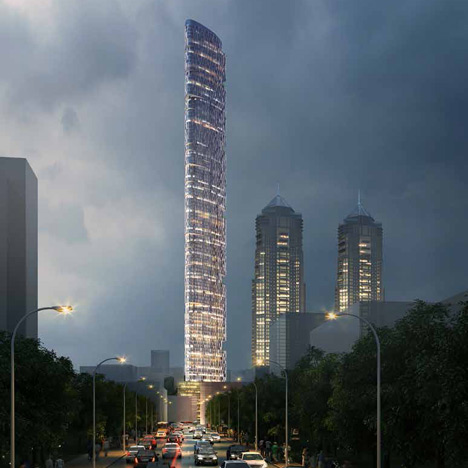
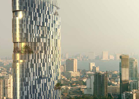
Dezeen today runs with the announcement that Adrian Smith + Gordon Gill Architecture has unveiled its competition-winning proposal to build Mumbai's tallest skyscraper.  At 400m, the 116-storey Imperial Tower would become the tallest building in the city.  The architects are an obvious choice.  Their kilometre-high Kingdom Tower in Saudi Arabia is currently under construction.

But this post is not primarily about the merits of very tall, high-tech apartment buildings in densely populated cities in the developing world.  That topic does deserve discussion, of course.

My concern in the here and now is, as usual, the deplorable quality of technical description that is included in these barely editorialised bits of prostituted journalism, which populate the plethora of designpop sites.

So, for instance, the breathless description: 'the tower would have a slender, aerodynamic shape designed to "confuse the wind" and withstand strong currents. . . Green terraces called "sky gardens" would also break up wind currents, say the architects . . . ' 

Give me a break.  Looking at the images, and taking them at face value, it first appears that the architects and engineers are going out of their way to create an aerofoil.  If so, you would expect wind flow to remain laminar, and actually to exaggerate lateral forces on the very tall building.  Which is the very opposite of the so-called 'buff' shapes of most buildings, which do indeed tend to break up that laminar flow and create considerable turbulence as the wind passes around the tower form.

But as usual, the devil is in the details.  If my aging eyesight does not deceive me, there are vertical ribs all over the apparently smooth surface.  It is those ribs that are doing all the work, in making sure that the wind flow detaches with many small vortices – but the text certainly does not draw attention to them.  Similarly, the sky gardens could contribute to the required irregularity of the form, except that for the wind exposure not to be unacceptably extreme, the sky gardens are actually visibly enclosed, and therefore contribute little aerodynamically.

The blurb about the other sustainability features is similarly inane.  What process water do you recover from cooling towers, if a majority of the extraordinarily extravagant apartments are conventionally air-conditioned?  If the discussion about water is to be meaningful, we would need to know how the architects and engineers found an alternative way of heat rejection, how they maximise harvesting rainwater at the times of the year when it is distressingly plentiful (during the monsoon), and how, if at all, water is stored on a seasonal timescale – something I have not heard anyone attempt on a constrained urban site with a very tall skyscraper.

There is a small difference between providing useful information, and that which is partially useful but dangerously misleading.  But as I have repeatedly commented, in architecture the latter is the chronic status quo.  

Every player in the process conspires to keep it that way.  Marketing blurb put out by the architects to bolster their business before news of actual performance of the building can catch up with the rhetorical claims.  Lazy and technically inept architectural journalism, repeating ad nauseam the same press releases.  And an engineering literature that is so carefully hidden away that it takes seriously hard work to top up the scant and useless technical information available on most architectural projects.  I despair.

Read the original article here.

Sunday 5 May 2013

Herzog & de Meuron's tower under way

In a current architectural zeitgest where it is much more likely that a skyscraper will look like a single monolithic polished shard, smooth skinned twisted stalagmite, or up-scaled zucchini, it is confronting to consider the virtues of the opposite: a tower of bits, apparently with lives of their own. 

Back in 2006, we were treated to images of Herzog & de Meuron's 56 Leonard Street in New York, a proposed 57-story residential in the Tribeca area, designed to house 145 residences, each one with its own unique floor plan and private outdoor space.  The marketing blurb described the $3.5 million to $33million apartments as “houses stacked in the sky.”  Then the GFC hit, and we heard no more.

But now, 56 Leonard Street is definitely under construction, the site bought by that perennially cashed up Australian construction giant, Lend Lease.  Predictably, progress is taking some time. Lower levels are typically the most complicated, but 56 Leonard has significant variations between each floor, complicating the structure and sure to lengthen the construction process. Completion is currently slated for 2015.

Philosophically, I am genuinely pleased to see such a building being realized.  A capacity to accommodate variation and identity was there in Corbusier's project for Algiers, surfaced often after and was given theoretical backbone by Habraaken's Supports. But those approaches envisaged the variation within a bounded structure. And they never really happened, except as squatter settlements in abandoned shells, such as the “Tower of David,” a 45-story uncompleted skyscraper, and the Confinanza Tower, both in downtown Caracas, Venezuela.

Herzog & de Meuron's building makes a virtue of almost removing organising boundaries, celebrating the irregular silhouette and bold cantilevers.  By exaggerating the transparency of the floor to ceiling glass, the tower becomes even less reassuringly solid.

That is where I find myself surprisingly ambivalent.  Feeling comfortable with the horizontality of Corbusier's vision, and the modest heights of Habraaken's Dutch models, I am actually quite viscerally uncomfortable about the dissolution of the high-rise form.  Mind you, the night rendering shows an exceptional, scintillating vision that is easy to be thrilled about.  In my terms, I guess light fills out the missing voids, and adds an illusion of bulk, even while the whole sparkles.

Finally, I find the only test I can think of is to mentally multiply Herzog & de Meuron's tower and compare it with a vision of many singular forms.  The former ends up a texture, a grain almost of organically adjusted adjacencies, a 3D textured background against which a few landmark buildings would stand out.  The latter will inevitably be a cacaphony of competing 'me, me, me' object buildings.  I prefer the prospect of the former.  Pity it's unlikely to happen.

Keep up with construction updates from NY on New York YIMBY.
For lots of images, and to register to buy, go to the project web site here.

The Internet of Things

If you haven't heard of it before, you better start keeping your eyes and ears open NOW.  To put it simply, the Internet of Things refers to the point at which connected devices are talking to each other, as well as to human beings.

It is, without a shred of doubt, where we are headed, and it would be more accurate to say we are already there.  Why is it important?  Because it opens up a world where the ubiquity of sensors, the ability of analyzing the vast amount of data, and the speed of communications to make it possible to act on that data quickly, changes all our expectations of how we solve problems, which previously seemed too hard.

This post is by no means intended as a potted introduction to either the foundation concepts, or the likely range of consequences of the Internet of Things.  In fact, preparing for a professional development workshop for architects in which I was hoping to do that, I found it remarkable how unimaginative and banal almost all of the projections of implications for the built environment are just now.  You can get some idea by checking out this infographic, or the relevant sections of 50 Sensor Applications for a Smarter World.  The list is the product of a workshop at a conference of experts in computing, so maybe that explains the disappointing ideas.

When I suggested at my workshop that we could expect a transformation not just of the lives of the affluent citizens of the developed world, but that the Internet of Things can make a significant difference in closing the poverty gap, I prepared to be met with predictable incredulity. As is reasonable, until you remember that the fundamental enabling technology for this step change is 'connected mobile devices'.

The archetype of those is the mobile phone, and it may surprise some that the number of SIMM cards sold has long ago exceeded the number of people in the world. Even allowing for inactive SIMMs and multiple accounts, the day we have a mobile for every man woman and child on the planet is quite close.

Already, Indian farmers are moving from subsistence to tradeable surplus, by accessing weather and market information provided by the central government, and urban Indian labourers for hire are bootstrapping themselves to greater earning power by using the phones to cut out middle men in sourcing jobs.
So it isn't an unreasonable projection to suggest that better data on urban utilities will help clean up theft and inefficiency, until the quality and lowered prices of services turn even the current slum dwellers into satisfied paying customers.  And it is this jump to the transformative potential of richer data that answers the question of 'why would we embed sensors all over the planet?'

There are many sources, of varying quality, to follow up this topic:
  • I found the white paper by Dale Evans for Cisco (the biggest frog in the internet communications pond), to be a good start.
  • The Internet of Things: How the Next Evolution of the Internet is Changing Everything
    is downloadable as a .PDF here.
  • The increasing necessity to acknowledge the interdependence of physical and communication planning is the basis of the blog post What an Urban Planner Should Look Like in the Internet Age by Emily Badger.  Read it here.
  • There is one monograph I am aware of, but haven't laid my hands on:
    Henry, Christopher. Volume # 28: Internet of Things 11 Sep 2011.  This edition of the quarterly magazine has a very large number of short articles, with competitively obscure titles, as the blurb says: "not just about framing the issue, but also about indicating a practice in the making: we call it correlation designing".
Watch this space.

I just noticed another infographic, in PCMagazine.  Check it out here.


Saturday 4 May 2013

Trees in the air 2

The opening of WOHA Architects' new Park Royal complex in Singapore appears at first sight to make nonsense of my recent post about trees on buildings (see Wrong green).  Or at least the hero shot makes it seem that way.

I felt a lot less threatened when I saw other images of the same building.  As usual, the camera so easily frames a potentially misleading message.

But I don't want to be churlish.  A lot of credit must be given WOHA for some remarkable aspects of the scheme.  The skygardens with their extended planter beds create micro environments and micro-climates that appear to radically transform the experience of circulation on upper floors, further enhanced by the use of natural materials such as light and dark wood, pebbles and water. There are technological systems with automatic light, rain and motion sensors, rainwater harvesting and recycling.  Enough sustainability bling to ensure the Park Royal on Pickering has been awarded the BCA Green Mark Platinum-the highest rating for green buildings in Singapore, And even the jarringly slick glazed tower bits can be favourably read, if one recognises that the choice of a narrow floor plate has made it possible for the interiors to be flooded with natural light.

This one I definitely want to see in real life.