I honestly don't know whether to be grateful to Dezeen for the endless parade of projects large and small that they bring me every day, and that at least for some of those collections of pictures, for the plans and other drawings that they also publish. Or, to give in to my recurring dismay at their complete lack of useful critical engagement with those projects. The text most often runs the gamut from inane simile ('BLAH Architects designed a cabana shaped like an ashtray') to the plain non-committal.
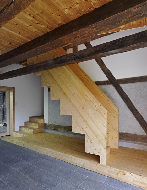
The latest to raise my ire is of the second type. I am a fan of adaptive reuse, an admirer of new work sensitively added to the historic, of high architecture extracted from an apparent adoption of the vernacular, of clever, tight planning, of direct craftsman-like use of natural materials, everything that seems to have gone into French architect Loïc Picquet's conversion of an old farm building into a rural guesthouse in the Alsace. It is instructive to view the article for the delightful, if far from comprehensive photos, but also for how little is the text that the editors have seen fit to attach to them.
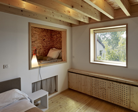
I would have let it go, as I usually do, until one moment of pure irritation. Disconnected from the image I reproduce below is the fragment of text that informs us "Floors are also wooden, while stable doors separate bedrooms from bathrooms and timber-framed cubbyholes contain extra beds and storage areas."
 Those cubbyholes were for me the 'Aha!' moment when I was sure that the qualities I enumerate above were the stance from which Picquet is working. After all, how often (outside Japan) do you see someone giving such literal form to Bachelard's most intimate proposition in his seminal 1958 book, The Poetics of Space? It is something to be celebrated; from it flows the responsibility to to theorize the project, to at least critique it.
I don't really expect the on-line zeens to get better at this, though ones like Inhabitat sometimes surprise me.But sometimes, I just have to get my frustration off my chest.
View the original article here:
http://www.dezeen.com/2013/05/15/farmhouse-renovation-by-loic-picquet/
The latest to raise my ire is of the second type. I am a fan of adaptive reuse, an admirer of new work sensitively added to the historic, of high architecture extracted from an apparent adoption of the vernacular, of clever, tight planning, of direct craftsman-like use of natural materials, everything that seems to have gone into French architect Loïc Picquet's conversion of an old farm building into a rural guesthouse in the Alsace. It is instructive to view the article for the delightful, if far from comprehensive photos, but also for how little is the text that the editors have seen fit to attach to them.
I would have let it go, as I usually do, until one moment of pure irritation. Disconnected from the image I reproduce below is the fragment of text that informs us "Floors are also wooden, while stable doors separate bedrooms from bathrooms and timber-framed cubbyholes contain extra beds and storage areas."
 Those cubbyholes were for me the 'Aha!' moment when I was sure that the qualities I enumerate above were the stance from which Picquet is working. After all, how often (outside Japan) do you see someone giving such literal form to Bachelard's most intimate proposition in his seminal 1958 book, The Poetics of Space? It is something to be celebrated; from it flows the responsibility to to theorize the project, to at least critique it.
 I don't really expect the on-line zeens to get better at this, though ones like Inhabitat sometimes surprise me.But sometimes, I just have to get my frustration off my chest.
View the original article here:
http://www.dezeen.com/2013/05/15/farmhouse-renovation-by-loic-picquet/

3 comments:
It has been a long time I notice that the website Dezeen isn’t providing enough contents and crits on the projects they published, or maybe due to its large amount of posts publishing every day. However, it can be seen that they sometimes they do publish some opinion journals, for example, your previous blog post on the topic At last, Dezeen has an opinion and Sorry green design, it’s over. The comments may be one-sided, but I found some quite interesting and thoughtful, like while I read your posts on 3D printings, ‘Sam Jacob’s on 3D printing’ published on Dezeen few months ago comes in my mind. “Sam Jacob argues that instead of liberating us, 3D printing will merely "bind us even more closely to fewer and fewer corporations".” I don’t have an opinion on 3D printings, but it worth to think, and discuss.
What I found Dezeen useful is how they provide me large amount of images, they are sometimes inspiring when you just look at the images. Although they may not be providing enough information or crit on the projects they introduced, it gives me interests to find out more when I found one interesting, from the hills of projects. This is how the ‘architecture and design’ websites, eg Archdaily & Dezeen work, finding out what catches your eyes, you go deep to the design by searching online or finding a book in the library.
http://www.dezeen.com/2013/02/07/sam-jacob-on-3d-printing/
I remember when I first searched on Dezeen, I was simply attracted by its lush and exciting images. And Every time I use this website is to looking for some inspiration, some visual enjoyment. However, after going through the photos each time, I always hope to see some useful reviews or some simple opinions or judgment. There are only some instructive descriptions, which only can satisfy some basic understanding or even worse, because sometimes there are not even enough photos been provided. Since I already get used to this situation, how I deal with it is to search it again through Google and get more information.
Lacking of critics is the most serious problems for lots of design magazines, it happens not only in Dezeen. Probably the editors get used to this way of doing design magazine, they get used to describe without adding their own comment, without critics.
However, I believe a good design magazine should not only provide lush and worthy information but more important to communicate with readers, to engage thinking. Images are only give the first sight, content should be read from not only photos but text.
In the case of Loïc Picquet's conversion of an old farm building into a rural guesthouse in the Alsace, cubbyholes that used for bedrooms give me a really wired feeling. What’s the relationship are if two or three people live in this space, which of them will live in the cubbyholes? There are obviously a lot of design problems worth to be thinking about, but the editors never mentioned. What they missed, is the most valuable intent of this magazine.
And last but not least, it is obviously that online Dezeens lack of appropriate corresponding editing of images and words, which may cause problems for readers.
When I came upon Dezeen, I did have the same opinion that it lacks certain information. For example, in one of their posts regarding the National September 11 Memorial Museum designed by architecture firm Snøhetta [http://www.dezeen.com/2014/05/14/national-september-11-memorial-museum-snohetta-new-york/]. They simply stated that the pavilion ‘follows the memorial’s sustainability design guidelines’ and it is said to receive a ‘LEED rating of Gold’, and then it went on to just LIST down the sustainable features that were used without showing how it is involved with the building itself.
So I thought about Dezeen's purpose, was Dezeen aimed to critique architecure in a sophiscated manner? I think no because it is just another website on the internet, where anyone can contribute. Lecturers always remind us to be cautious in finding reliable resources when doing research. I think Dezeen should be treated like a gossip magazine. It provides us images to give an idea of the building along with some basic information.
On top of that, the 'pretty' images are not just for satisfaction but are also for architects and designers to train to analyse ideas and concepts. With so many articles written everyday, we do not have the time to read every single text so images compensates for that.
Therefore, I don't think Dezeen's purpose is to give critical point of views. So for research purposes, it is better to look at more reliable sources like the books in the library.
Post a Comment